Apple’s recently-released first beta of iOS 9.3 brought with it some new features while also tweaking some existing functionality. While the likes of Night Shift will get all of the attention, changes like having the Wi-Fi Assist option now also show how much data has been used will likely go unnoticed by most, but appreciated by those that do spy it. There are other changes that may not be whole new features but are likely to be the kind that get noticed, just because they’re hard to miss, like new Safari alert dialog interface.
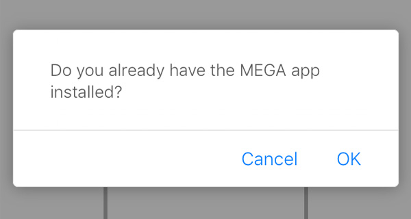
Showing up in iOS 9.3 is what appears to be a new Safari JavaScript dialog with an interface that takes what has come before it and adds a much more 2D, clean look to it. We first noticed this alteration in iOS 9.3 beta 1 not long after installing it, but haven’t noticed it since. Now, a Reddit thread has appeared that not only confirms that we weren’t imagining things the first time round, but also has some examples of what the new interface actually looks like for those not currently running the beta.

At a quick glance, it has to be said that this new interface looks very much like it would be quite at home on any Android device, and while still following the design choices of iOS 7 onward, it’s difficult to argue that there isn’t at least a little Android here. The buttons have been moved to the right and grouped closer together while borders around each have been removed. The rounded edges of the alert, however, still have a larger radius than that in Google’s current Material Design language for Android.
Android 5.0 alert interface (left) versus the new JavaScript alert dialog in iOS 9.3 beta 1 (right)
We like the new interface because it’s super clean, though there’s a lot of wasted space that we’re sure could be fixed before iOS 9.3 becomes available to everyone. After all, that’s kind of what these betas are for.
Update x1: As a reader points out, the new alert design belongs to improved JavaScript dialogs added to Safari as a security measure. We’ve updated the post accordingly.
(Source: Reddit)
You may also like to check out:
- iOS 9.3 Beta 1 Vs iOS 9.2 Speed Comparison [Video]
- iOS 9.3 Jailbreak Demoed On Video
- iOS 9.3 Features Ability To Hide Stock Apple Apps You Don’t Need
You can follow us on Twitter, add us to your circle on Google+ or like our Facebook page to keep yourself updated on all the latest from Microsoft, Google, Apple and the Web.
