Here’s a visual comparison of iOS 9 beta vs iOS 8, showing differences and all the changes which Apple has made in its latest OS for mobile devices.
Apple announced iOS 9 at its opening WWDC 2015 keynote. And while iOS 9 was rumored to be a super bug fix and performance update, Apple sneaked in quite a lot of surprises for both iPhones and iPads.
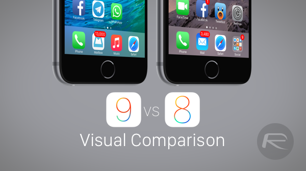
Here we are going to compare the first beta of iOS 9 with the latest iOS 8 release, which is 8.3, visually, giving our readers a glimpse of what they should expect once the final build of Apple’s latest mobile operating system hits download channels later this year.
Note: iOS 9 beta screenshots on the left, iOS 8.3 on the right
iOS 9 on iPhone:
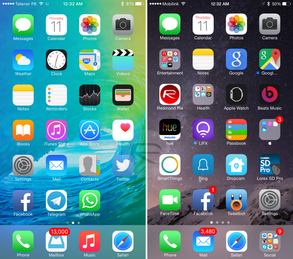
Home Screen: Noticed the new Wallet app? It replaces Passbook. System-wide font has also been changed from ‘Helvetica Neue’ to ‘San Francisco’.
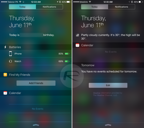
Notification Center. Yup, iOS 9 has a stock widget to show battery status of iPhone and connected Apple Watch along with a new widget for Find My Friends. Battery widget is available on iPhones only, not iPads.
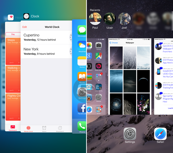
Multitasking on iPhone.
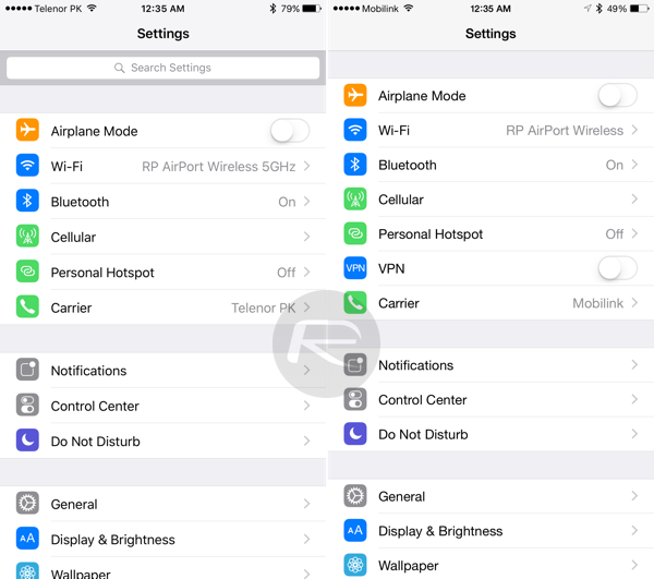
Settings: New search field at top in iOS 9.
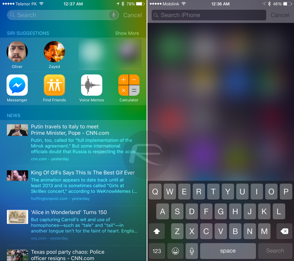
Spotlight Search: New page on left of home screen with Siri suggestions for contacts and apps, and news, all based on your frequency of use and location.
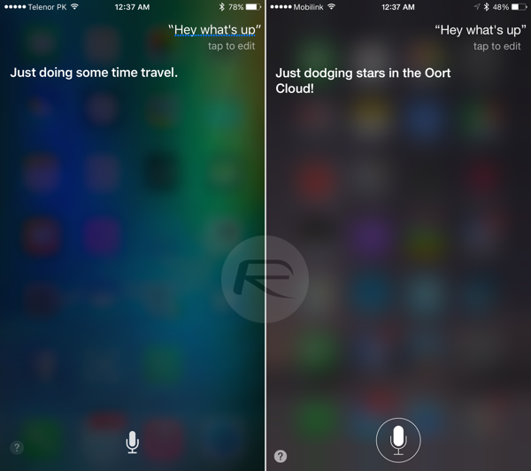
Siri UI (a)
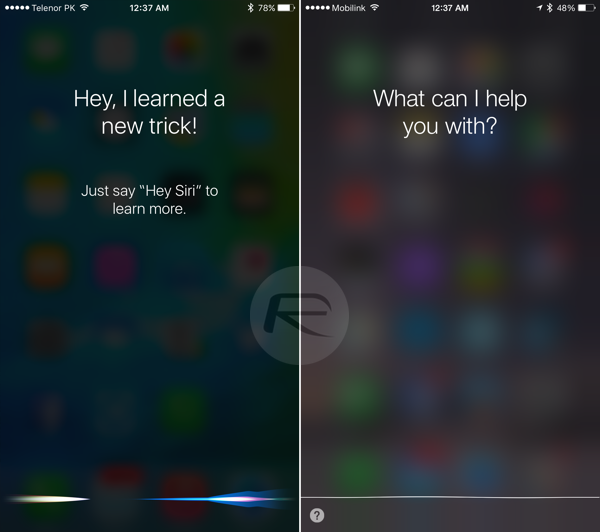
Siri UI (b)
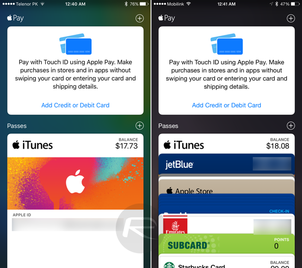
Wallet app Vs Passbook app
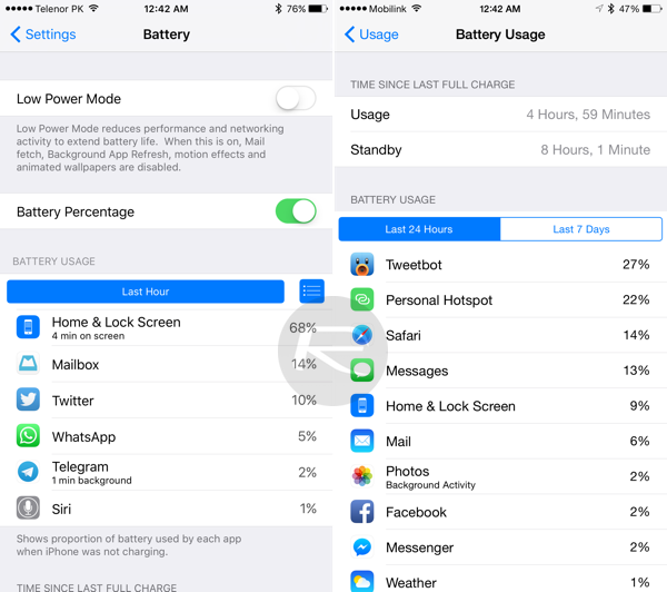
Battery Settings: The all new ‘Low Power Mode’ option and some changes in ‘Battery Usage’ UI can be seen here.
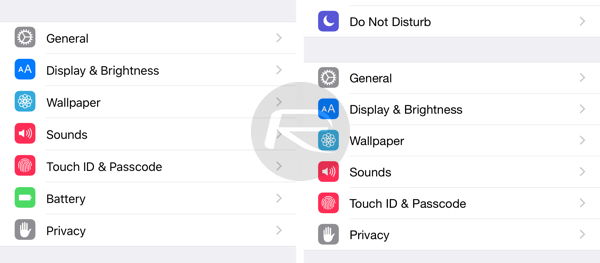
New ‘Battery’ option is front and center in iOS 9 Settings app.
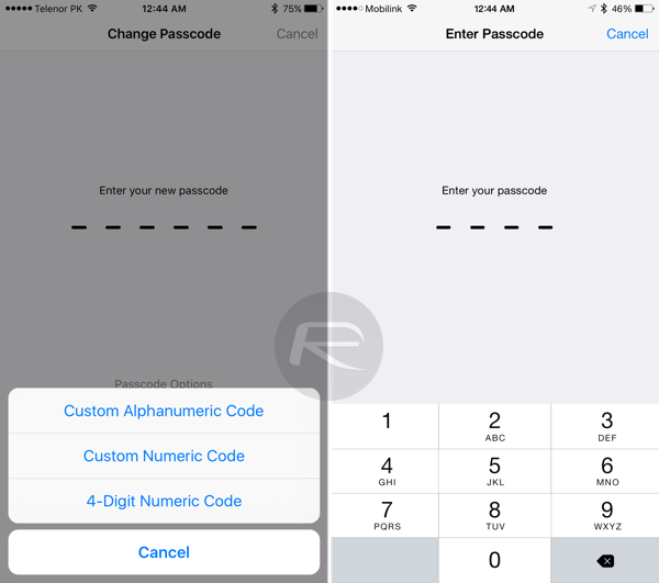
Passcode: Six-digit Passcode is now default for Touch ID devices, four-digit for non-Touch ID devices. Both type of devices can optionally change to six-digit or four-digit.
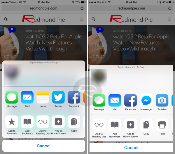
Share Sheet: Round edges can be seen in iOS 9 screenshot.
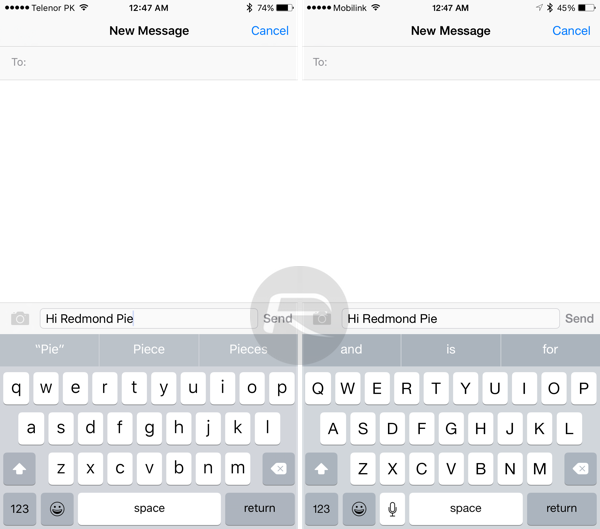
Keyboard: Upper / Lower case letter keys in iOS 9.
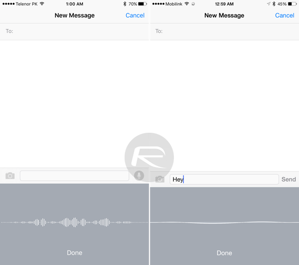
Dictation UI
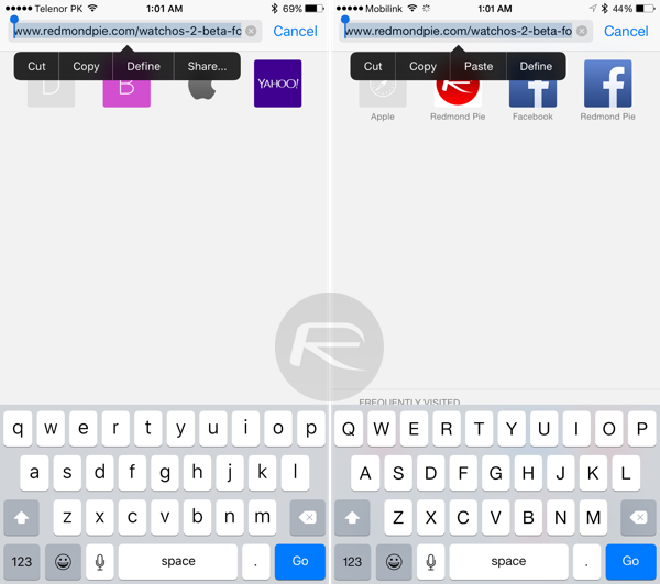
New ‘Share’ option for links.
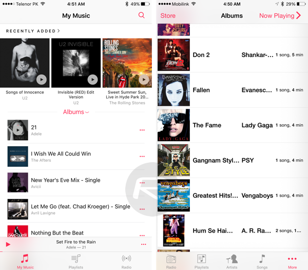
Music app tweaks (a)
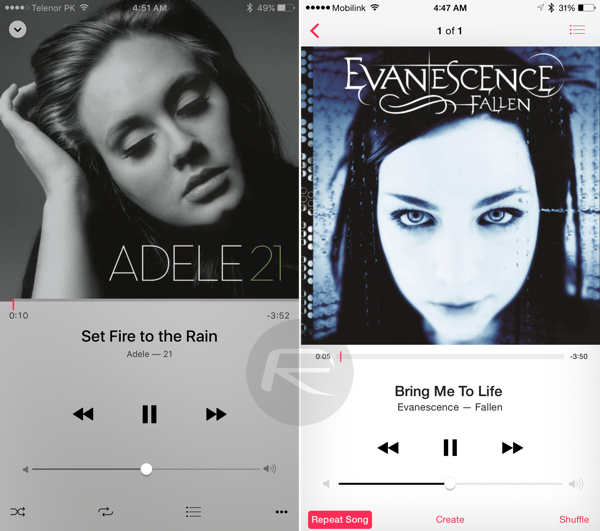
Music app tweaks (b)
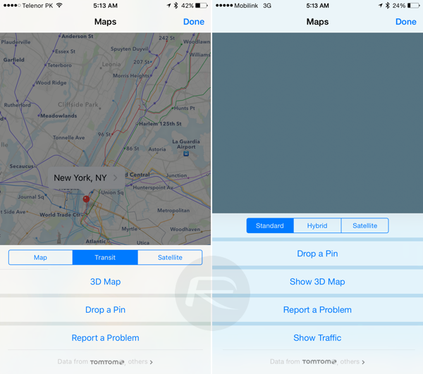
Transit feature in iOS 9 Maps app.
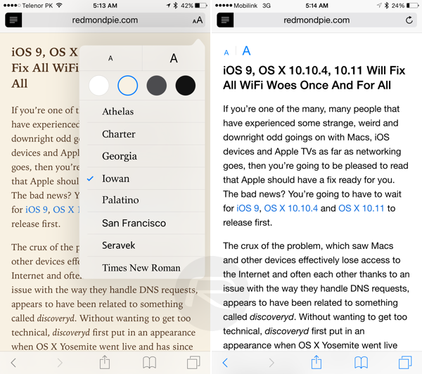
New Reader Mode in Safari lets you select the background color and typography.
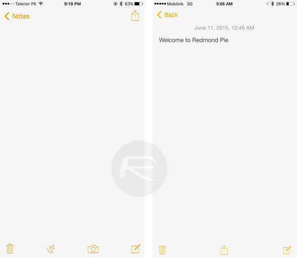
New iOS 9 Notes app: Options for adding sketches/drawings, photos, change text formatting, add check lists and more.
iOS 9 on iPad:
Here are a few screenshots showing the major new changes in iOS 9 beta for iPad:
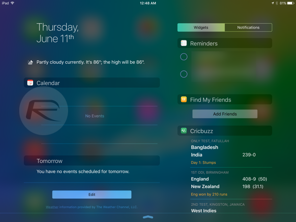
Notification Center in landscape.
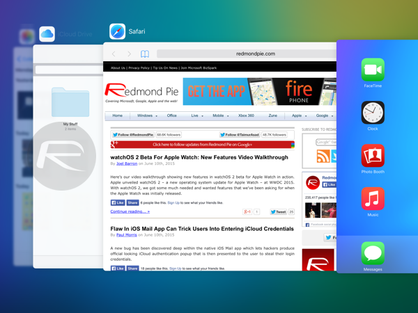
Multitasking on iPad.
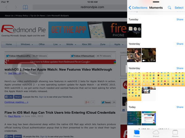
Slide Over in landscape.
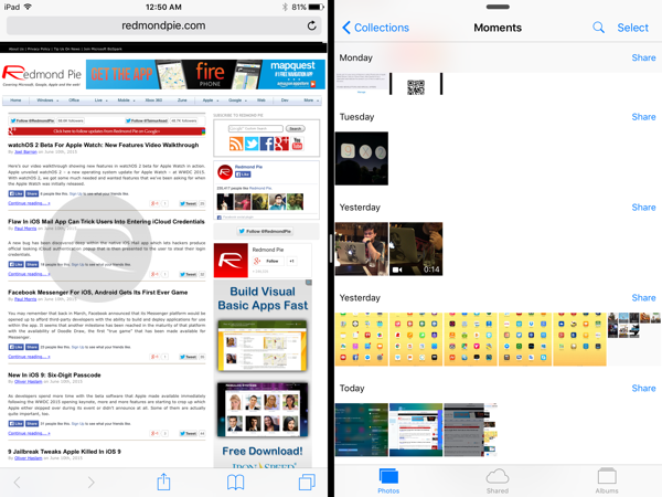
Split View in landscape.

App Switching in Slide Over.

Picture in Picture (PiP)
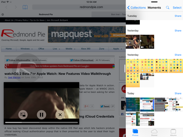
Picture in Picture + Slide Over
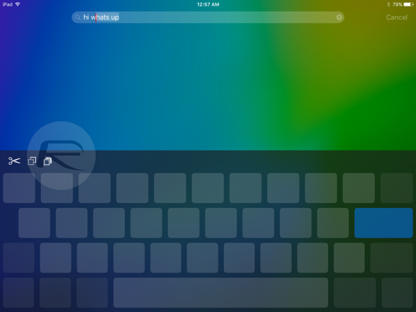
New keyboard gesture for selecting text.
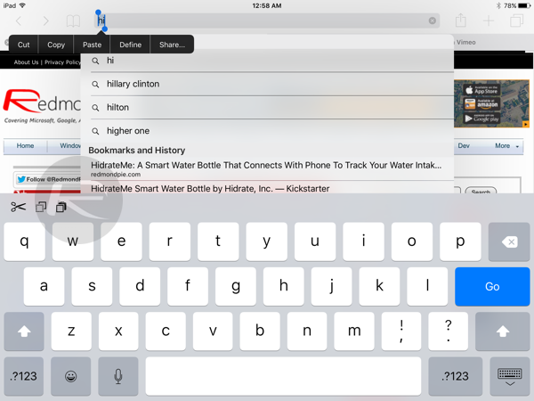
New ‘Share’ option for links on iPad.
As you can see from the screenshots above, there’s a lot to take home. Starting from the brand new font – San Francisco – which Apple debuted with the Apple Watch to new multitasking features in iPad, there’s a lot to like about iOS 9. Contrary to rumors, it’s a massive release for Apple, developers and consumers alike.
There are probably many other small changes too which we are still hunting for. We will keep updating this post with any other visual change that we can find in iOS 9 compared to iOS 8. If you think we missed something, please let us know in the comments below.
Want to see the above iOS 9 features in action on video? Check out our hands-on with iOS 9 for iPhone and iPad here: iOS 9 Beta Features: Hands-On Video Walkthrough.
You may also like to check out:
- Apple iOS 9 Announced: Features, Release Date And More
- Download iOS 9 Beta 1 And Install On iPhone 6, 6 Plus, 5s, 5c, 5, 4S, iPad, iPod touch [Tutorial]
You can follow us on Twitter, add us to your circle on Google+ or like our Facebook page to keep yourself updated on all the latest from Microsoft, Google, Apple and the web.

