With the Worldwide Developers Conference now almost upon us, and as such, it should come as little surprise to see designers and general Apple enthusiasts getting their last-ditch concept ideas in before the lock. From what we’ve gathered, iOS 8 will include several new features and apps, including Healthbook among other goodies, but while we don’t anticipate system-wide widget support complete with live tiles, this hasn’t stopped one designer from bundling it into his latest concept.
Whenever WWDC is officially announced by Apple, it always seems like a long time away, but such has been the persistence of the rumor mill this time around, that the annual event has almost crept upon us. On Monday, Tim Cook will take to the stage, where he and several other Apple executives and key members of the team will unveil some exciting new products, and although we’ve heard rumors of new hardware, it’s pretty much a banker that both OS X 10.10 and iOS 8 will finally be revealed.

Even though we’re braced for a multitude of new features with iOS 8, it would be great if Apple could make more use of the rather static, one-dimensional home screen.
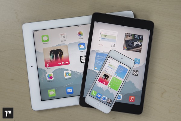
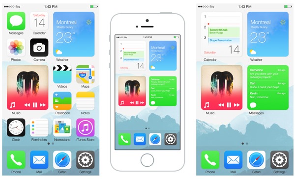
At present, and as has been the case since the iPhone’s inception, the iOS home screen comprises a bunch of orderly-arranged icons, and aside from tapping on them to open an app, they serve no additional function. The likes of Windows Phone, with its novel tiled interface, allows users to preview photos, check weather and other such information without needing to go ahead and open up any apps, and designer Jay Machalani has done something similar here but for iOS.

By performing a spread gesture on an icon, a live tile / widget appears, and from there, various info relating to that app is displayed. Not only is it a great idea and something that iOS is clearly lacking, but the way Machalani has implemented it here is both seamless and functional, in-keeping with Apple’s own software design ethos, and we’re so impressed by his work on this concept that we’d probably swap all of the rumored iOS 8 features for something like this.
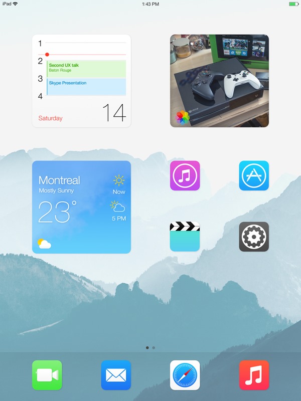
Check the video below, and as ever, do leave your comments in the space beneath this article.
(Source: JayMachalani) (via: TheVerge)
You might also like to check out:
You can follow us on Twitter, add us to your circle on Google+ or like our Facebook page to keep yourself updated on all the latest from Microsoft, Google, Apple and the Web.

