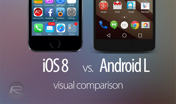
Having visually compared Android L with KitKat, we found out that Google is pushing hard to take Android one step further from where it stands right now. But how does it compare to its fiercest upcoming rival, iOS 8? That’s exactly what we’re going to find out, by comparing Android L preview with iOS 8 beta, visually.
Before we dive into the comparison, it’s worth mentioning that Android and iOS are completely different platforms (obviously). The hardware it runs on, to the apps that are developed for them come from different roots, but nonetheless, both are fighting fiercely in the mobile space for dominance.

On the consumer front, both are feature-rich platforms, and Apple has done all it can in its power to entice users to jump on the bandwagon once again, and same can be said for Google. But it’s the small things that makes or breaks the platform as a whole, and this time around, Apple has opened up to developers to offer more choice to the user by offering third-party keyboards, Notification Center widgets support etc.
Both platforms have a visual identity of their own and that can be seen at first glance, but in some areas they offer similar functionality.
Sometimes it’s the visual outlook of a platform that becomes the first priority of choice for a user, and to say the least, iOS 8 is without a doubt a modern looking platform, with Android L playing catch-up in this department.
The visual comparison we have done below is great way to get an insight what you – the user – will be getting when fall season arrives. Without further ado, let’s jump right in!
iOS 8 lock screen (left) vs. Android L lock screen (right)
iOS 8 home screen (left) vs. Android L home screen (right)
iOS 8 Phone app (left) vs. Android L Phone app (right)
iOS 8 Calendar app (left) vs. Android L Calendar app (right)
iOS 8 Calculator app (left) vs. Android L Calculator app (right)
iOS 8 keyboard (left) vs. Android L keyboard (right)
iOS 8 Control Center (left) vs. Android L quick toggles (right)
iOS 8 Settings app (left) vs. Android L Settings app (right)
iOS 8 multitasking (left) vs. Android L multitasking (right)
iOS 8 quick-reply in Notification Center (left) vs. Android L notifications (right)
iOS 8 quick-reply on lock screen (left) vs. Android L notifications on lock screen (right)
You may also like to check out:
- Android L Preview Vs Android KitKat – Visual Comparison [Screenshots]
- iOS 8 Beta Vs iOS 7 – Visual Comparison [Screenshots]
You can follow us on Twitter, add us to your circle on Google+ or like our Facebook page to keep yourself updated on all the latest from Microsoft, Google, Apple and the Web.
