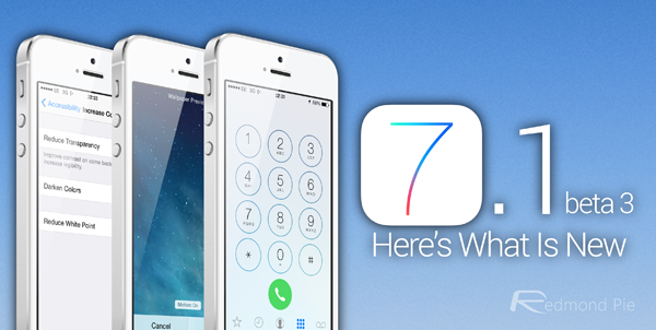
So here we are again. Another Tuesday, and another iOS beta release has winged its way out of Apple’s developer program and onto iPhones, iPads and iPod touches the world over. One of those iPhones is in my possession, and I’ve been using iOS 7.1 beta 3 for a few hours now. The verdict? Well, it’s iOS 7, but even though the big point-o release of September saw changes on a grand scale, somehow Apple is still finding design tweaks to make, and buttons to fiddle with. In the third beta release of iOS 7.1, someone in Cupertino’s been at the interface design once again.


I’m sure that at this point, assuming you’ve even a passing interest in what happens in beta releases of Apple’s mobile operating system, then you’ve already caught yourself up on what has been discovered in this new release. For those that haven’t, or would rather see it put into words by a mildly grumpy Englishman, here’s what we’ve found so far. It’s mostly a collection of visual tweaks, but there are some usability and accessibility alterations along the way:


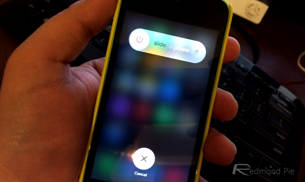
– A fancy new power-off interface. It’s about as exciting as you would expect, really. Instead of the old interface for sliding to power-off an iOS device, we’ve now got a new one where you, you guessed it, slide to power-off. Think circles, and you won’t be far off.


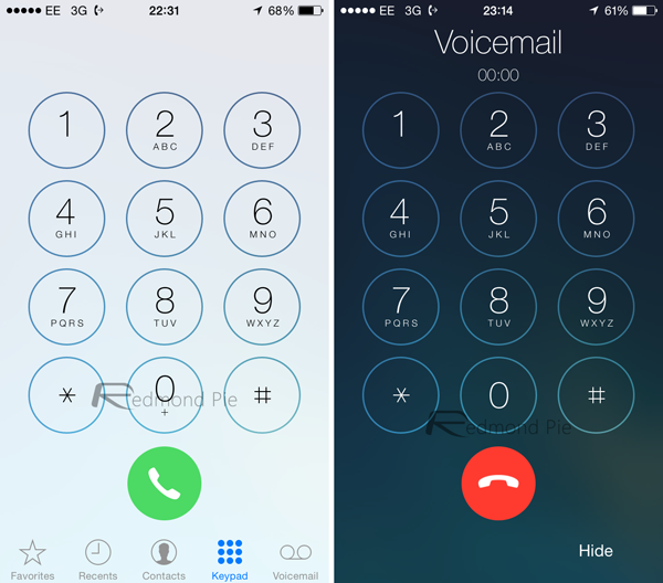
– That circular theme follows through to the call dialer and in-call buttons, too. The end-call button, for example, is now a circle, mimicking the kind of button that was previously used for the number pad when making a new call. It all strikes us as changing things for the sake of changing things, but maybe we’re missing the point.
– On the accessibility front, people with sickness issues will be pleased to know that they can now disable the parallax movement on the home screen wallpaper separately from all the other parallax stuff that goes on in iOS 7. The new option appears when setting a new wallpaper, rather than living in the Settings app proper.
– When using bold fonts, the effect of that feature goes beyond just fonts. If you launch Safari for instance, you’ll notice that the UI elements are bold as well, which is kinda nice. Bold fonts can be accessed in the Accessibility options in Settings.
– There’s also a new option to turn down the entire iOS ‘whiteness’ by flicking the ‘Reduce White Point’ switch. Whites get less white, which saves us turning the brightness down when apps like Safari are trying to burn things into our retinas!
– Speaking of Safari, the browser has a newly refreshed search bar with some slightly different wording. Exciting!
– The Music app has also seen a slight refresh, or at least two of its buttons have. The ‘Repeat’ and ‘Shuffle’ buttons have had a lick of paint. New buttons are most definitely the order of the day in Cupertino, it would seem.
– Anyone who likes creating iTunes Radio stations will notice that the ‘New’ button is, well, new.
– Stock iOS apps that are green – Messages, FaceTime etc. – are now a darker shade of green. Only slightly, but yeah, darker.
– The iOS keyboard has had some work done on it too. The backspace and shift keys have new highlighting, and the interface in general looks to have had the contrast turned up a notch. It’s subtle, but it does seem to be there.
– When you’re applying filters to photos, the UI has been slightly refreshed as well. Not that much, but it’s noticeable.
Beyond buttons, this new beta release does seem to have walked back some of the speed improvements that previous betas have brought about. Opening folders, closing apps and similar transitions feel slower than they did. I’ve not done any timing, and I’ve not got anything with beta 2 and beta 3 on to test side-by-side, either. It ‘feels’ slower though, so take that as you will.
Like I said earlier though, this is after just a few hours of iOS 7.1 beta 3 use, and I’m sure more things will be discovered as time goes by. So far though, fancy new buttons aside, there doesn’t seem to be much new.
At least on the surface, that is.
You may also like to check out:
You can follow us on Twitter, add us to your circle on Google+ or like our Facebook page to keep yourself updated on all the latest from Microsoft, Google, Apple and the Web.
