You surely know the drill by now. With each and every new beta release of iOS over the last twelve months, I’ve been putting myself through the growing pains of living with a beta operating system on a day-to-day device so that you don’t have to. It’s been hard at times, especially when iOS 7 was just getting started and most of my favorite apps would crash out, seemingly on a whim and completely at random, but generally it’s been worth the hassle. And then iOS 7.1 beta 1 came around, and I was once again reminded why betas aren’t for everyone.
Apple’s first attempt at iOS 7.1 came out a month ago, and I’ve been using it all this time. At this point it’s fairly safe to say that while Apple once again saw fit to speed up some animations, it dropped the ball on stability. And we’re back to having apps crashing as well, though I can cope with that much easier than I can with iOS getting its knickers in a twist when I use the stock apps. To say I was ready for the second beta was an understatement, and it was clear that there needed to be one; whatever Apple has changed under the hood in 7.1, it’s big enough to cause problems throughout the OS, and it’s certainly not ready for primetime.
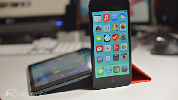
At least, beta 1 wasn’t. The jury is still out on its new and improved self.
I’ve been using iOS 7 beta 2 for a few hours now, and unlike beta 1, I’ve managed to get through those hours without any OS restarts. We’ve still got apps crashing out, and I can now add some new ones to the list, but that’s what you get when you play this game. Still, you’d expect Apple to be able to keep the operating system functioning underneath those apps. Here’s hoping for continued stability on that front.
As far as changes go, there’s no doubt that Apple has once again tweaked the animation times. Opening and closing folders is faster. Quitting apps is quicker. Swiping through menus and screens is more fluid. It was never going to get slower though, was it?
Those who like bouncing animations will be pleased to hear that Control Center now bounces when it reaches its fully opened state, which is….nice.
Video credit: Twitter
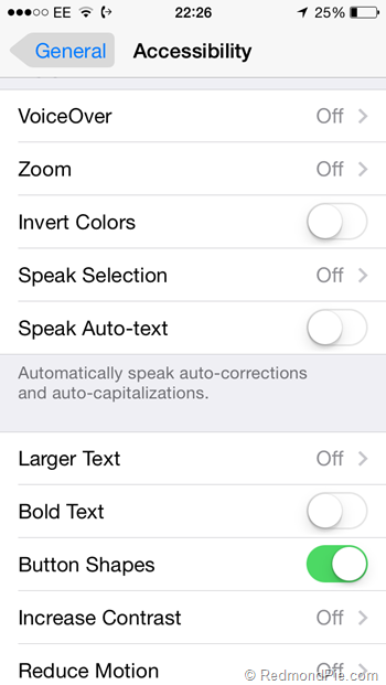
Much more useful is the ability to now turn on backgrounds to buttons that were previously just text, making them easier to differentiate and ultimately, use. It’s a slight step back from the completely 2D interface Apple was previously favoring, and one that will be welcomed by many.
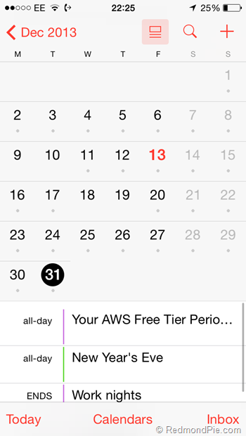
The new beta also sees a revamped list view toggle and display in the Calendar app too, which is well overdue and actually makes the list view usable again and those with iPads will be pleased to hear that the wallpaper from Apple’s own iPad Air ad is now included as standard.
There doesn’t appear to be any huge and glaringly obvious changes in interface or functionality, save the moving of some Touch ID settings and the removal of the option to use the dark keyboard which was introduced in Beta 1.
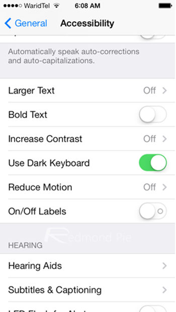
Screenshot from iOS 7.1 beta 1: ‘Use Dark Keyboard’ option has been removed in iOS 7.1 Beta 2
Also as first discovered by 9to5Mac, iOS 7.1 beta 2 also includes an option to enable iOS in the car feature, as can be seen in the screenshot below from Restrictions menu in beta 2:
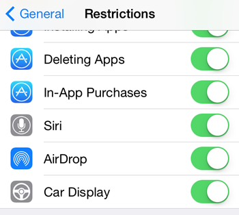
It’s clear that Apple is still tweaking things here and there, and I wouldn’t be surprised to see at least one more beta before iOS 7.1 makes its way to an iPhone or iPad near you. In its current state, unless beta 2 turns out to be a revelation, I’d say Apple has quite a bit of tidying up to do before it’s good to go.
That is what betas are for, after all.
You may also like to check out:
- iOS 7.1 Beta 2 Download For iPhone, iPad And iPod touch Released
- Download iOS 7.1 Beta 1 For iPhone, iPad, iPod touch
You can follow us on Twitter, add us to your circle on Google+ or like our Facebook page to keep yourself updated on all the latest from Microsoft, Google, Apple and the web.

