Some very interesting information pertaining to Apple’s iOS 7 has emerged today, which will see reasonably thorough makeover retaining many familiar aspects whilst "flattening" much of the user interface, as reported before. Although, as 9to5Mac reports, the changes will be some of the most significant the software has seen in its lifetime, it is also reckoned that users will have little trouble adapting to the changes.
Apple has already confirmed June 10th as being the date of the commencement of WWDC 2013 this year, and with tickets having sold out in under two minutes, it would appear as though Apple enthusiasts are perhaps more expectant than ever. Nowhere more so is this anticipation concentrated than with the company’s mobile operating system, iOS, which some would argue has stagnated over the past couple of years, and following the disastrous Maps app of iOS 6 and subsequent departure of iOS Senior Vice President Scott Forstall, it is hoped that the ecosystem is in for some big alterations moving forward.

Jony Ive, said to be a loather of the skeuomorphism that both Forstall and the late Steve Jobs loved to see, has had a much bigger impact on software this time around, and thanks largely to his input, iPhone, iPad and iPod touch users can expect the following:
Flat Interface In iOS 7
No big shocks here. According to the sources, the OS – which is codenamed as “Innsbruck” – will be “very, very flat,” and all that skeuomorphic gloss atop app icons will be a thing of the past. In fact, the whole icon set for Apple’s native apps will be changed, and we’d fully expect developers of third-party apps to follow suit. As well, tool and tab bars will also be completely redesigned, and it’s fair to say few remnants of Forstall (and dare I say, Jobs) will remain in terms of the iOS aesthetics.
‘Polarizing Filters’
iOS 7 may also included so-called polarizing filters, which will decrease the viewing angles of those looking over your shoulder, in turn affording you some privacy. There are plenty of screen protectors out there offering the same kind of thing, but native software improvements, particularly those pertaining to privacy, are always welcome to the party.
More Information at a Glance
We’ve established that iOS will be much more simplified, and Apple is also said to be testing ways to enable users to view information passively. On Android, the use of widgets, for example, means users can check certain feeds, the temperature outside, or other such information just by glancing at their device or with very little further interaction, and as part of the process of making iOS a more user-friendly experience, the fruit company is thought to be exploring a number of options.
One popular idea is that of allowing panels either side of the display to be pulled from obscurity, akin to the manner in which the Notification Center is opened on OS X using the trackpad.
Exposé-like Multitasking
Apple considered this idea back before the release of iOS 4, but instead went for the rather one-dimensional functionality seen today. With Ive now very much at the helm of proceedings, it’s likely this feature will be given some kind of attention, particularly seeing as many have spoken up to bash the multitasking from the get-go.

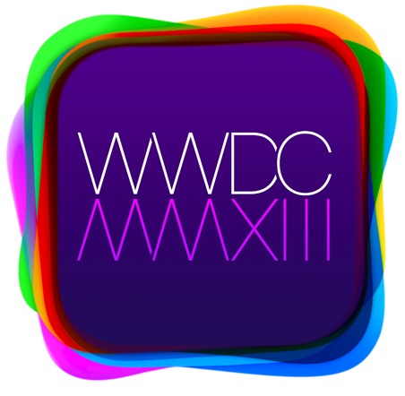
Even the WWDC logo for this year’s developer gathering alludes to a flatter, cleaner look for iOS, and given that we’re just around seven weeks from WWDC 2013, we shan’t have to wait long to see exactly what Apple has got up its sleeve.

As a long-time iOS user, I am relatively enthused by the notion of better multitasking and in particular, the fact that getting information from an iOS device perhaps won’t be as painstaking as it can often be. In terms of the flat designs, I am on the fence, for if iOS had actually evolved as it should have during the past few revisions, I don’t feel as though we’d be as focused on it as we are.
What do you think? Would Exposé-esque multitasking, a flatter appearance and easily consumable information at a glance float your boat with iOS 7? Please do share your comments below.
(Source: 9to5Mac)
You can follow us on Twitter, add us to your circle on Google+ or like our Facebook page to keep yourself updated on all the latest from Microsoft, Google, Apple and the web.

