The time is fast approaching for Tim Cook and his cohorts to adorn that Moscone Center stage and introduce the world to the sixth-generation iPhone, which in turn will more than likely bring with it an immediate release of iOS 6, the company’s next major revision of their mobile operating system. Registered members of the iOS dev program are now regularly using the fourth beta of iOS 6 in an attempt to familiarize themselves with the new features and improvements which Apple has pushed out, as well as trying to find and report any bugs that may exist.
Although each beta release brings with it a few little enhancements, feature upgrades and notable stability enhancements, Apple has taken the opportunity to make some behind-the-scenes changes to how the App Store functions within iOS 6. Although the App Store appears to be a native iOS app, it essentially is just a wrapper for a web service which Apple maintains from their end, meaning that they can tinker and change things in the background then push it out to users when the app is launched. Probably the most notable thing to be amended with this stealth update is the interface that is displayed to the user when searching for apps.

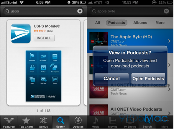
Apple has decided in their eternal wisdom that the best way to display returned results to the user is through a rather attractive set of swipeable cards that not only display the accumulated number of stars based on user reviews of the specific app, but also show a selected screenshot of the chosen app to allow users to immediately get a visual impression of what they are dealing with. The much-loved Purchased section has also made an appearance, allowing iOS 6 users to quickly view all of their purchased and downloaded apps and install them to the device with one tap, as noted by 9to5Mac.

As part of the continuing development of the App and iTunes stores, the company has also made some changes within the iTunes app on iOS devices that brings back the ability to search for podcasts and yes, you guessed it, quickly open them up directly through their own native Podcasts app. Considering the relatively new Podcasts software has come in for a pretty unified kicking from users, it remains to be seen whether or not this is a good thing, but it certainly gives a little more power to the user. Although there is nothing really new or earth shattering in these minor changes, it’s nice to see the continued progression of the software and we can no doubt expect a few more additions before a public release in the coming month.
You can follow us on Twitter, add us to your circle on Google+ or like our Facebook page to keep yourself updated on all the latest from Microsoft, Google, Apple and the web.

