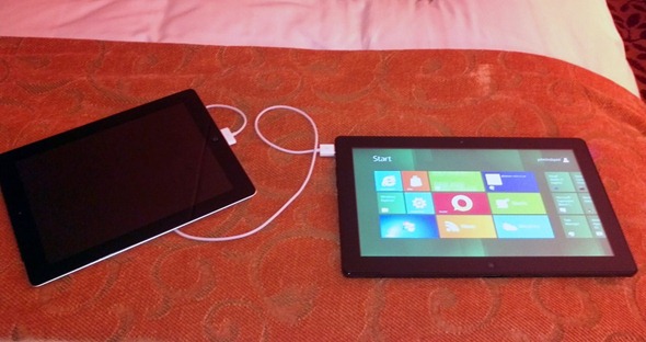
With Microsoft unveiling its developer preview of Windows 8 Tablet this week, it was only a matter of time before the inevitable comparisons began to appear. Courtesy of WinRumors’ Tom Warren, we’ve a first look at Microsoft’s new mobile operating system pitched with the current daddy of the tablet market – the iPad 2 running iOS 5.
image credit: UzEE’s Journal
The comparison begins with a basic overview of the lock screens, which are quintessentially identical, barring the fact that the Windows version is visually similar to the sort of interface present for years in the desktop version of Windows. The Windows lock screen looks a great deal more polished, and up against iOS helps to encapsulate nicely the contrasting ideas between Apple and Microsoft on how things should look. Windows 8 lock screen surely has a huge advantage, because of Windows 8’s ability to run both full fledged desktop OS and Metro-style-Tablet-optimized Start menu (without compromising any performance), it has roaming (using Windows Live ID) user profiles/accounts, something which both iOS and Android OS are currently missing.
Next up is the home screen, arguably the most important page on any smartphone or tablet in terms of looks, ality, usability and features. iOS, as we know, shows row upon row of icons, and is outclassed quite significantly by the much talked-about Metro UI – Microsoft’s best effort yet in the design stakes by a country mile. Furthermore, the easily customizable tiles actively stream data and updates in a widget-like fashion, lessening the need for unnecessary navigation as the information is there for all to see.
The HTML5 browsing experience appears similar on both devices, with Windows 8 also allowing a keyboard split for less intrusive typing. The response from both keyboards are pretty indistinguishable.
The settings page comparison has contrasting overtones, though, with iOS allowing for many app-specific changes to be made, whilst the Windows "Control Panel" follows a similar trend to the desktop Windows CP we’ve become accustomed to over the years, focusing mainly on system configuration, sharing and search features. As noted though, this is early Alpha, and will probably be subject to modification by the time the v1 reaches the end-user.
All in all, the comparison shows that the Windows device is more interactive than its iOS counterpart, although this is the case with most others on the market as Android includes the widgets and sidebars currently not (yet) present in iOS. Probably definitely too early to make any outlandish statements, as iOS 5 is almost ready for primetime use while Windows 8 on the other hand is almost a year away from final release.
You can watch the full review, which is around 10 minutes long, embedded below, and draw your own conclusion.
Don’t forget to tell us about your pick using the voting system embedded below!
You can follow us on Twitter or join our Facebook fanpage to keep yourself updated on all the latest from Microsoft, Google and Apple.

