Releases of the first beta of a brand new version of iOS are a big thing, and we’ve now had ten of them if you include the first iPhone. We’re going to, because ten’s a nice number, and iOS 10 is a nice bit of software, as anyone who watched or followed Apple’s big unveiling of it will attest. Building on the work that iOS 7, 8 and 9 did before it, iOS 10 takes a formula that has been honed for years and adds yet more spit and polish, with the end result being something that takes the platform a step further, gives it new teeth, and a new lease on life. It may not be the huge departure that Mac OS X was when it turned the Mac on its head all those years ago, but it’s not a bad update regardless.
As I did for each of the last few years, yesterday, I downloaded the very first beta of a new version of iOS and installed it on my daily driver. My go-to phone. The one I have with me 24/7 and the one I rely on. I know, I’m a little bit mad. But that’s good, right?
I know installing betas on critical devices is crazy-making. For anyone else, I’d strongly recommend not doing exactly what I do each year. The dangers are many, and the warnings are stark. Install beta software on a device you rely on, and you will get burnt. It will happen eventually. But hey, you could say similar things about jumping out of airplanes and deep sea diving. Eventually, if you do it enough, something’s going to go wrong, but we still do it, because it’s fun, and we’re a bit crazy. Sometimes, very crazy.
Deep down, I think I like just like new toys, and iOS 10 is the new hotness right now. Armed with the backup plan of a restore image of iOS 9.3.x and a Nexus 5X should all hell break loose, I installed iOS 10 beta 1 on my iPhone 6s about 24 hours ago. So far, so good.
Straight off the bat, let me say I’ve had no issues that I would call showstoppers. There are some issues with third-party apps not liking some of the new widget layouts, for example, and Speedtest.net refuses to play ball, but it’s a beta and developers got it less than a day ago. If they’re at WWDC, they likely spent 23 of those hours drunk, so we’ll let them off.
So a day in, how’s iOS 10 looking so far? Well, I’m not going to go into great detail because there’s a lot to test and try out. Instead, I’m going to pick a few things that have caught my eye and tell you about those. If over the coming days and weeks, I find myself with the urge to share more, as Apple tweaks and alters iOS with each additional beta release, I’ll be back here telling you all about it. I know, I know. You can hardly wait.
So let’s have a look, shall we?
The New Lock Screen
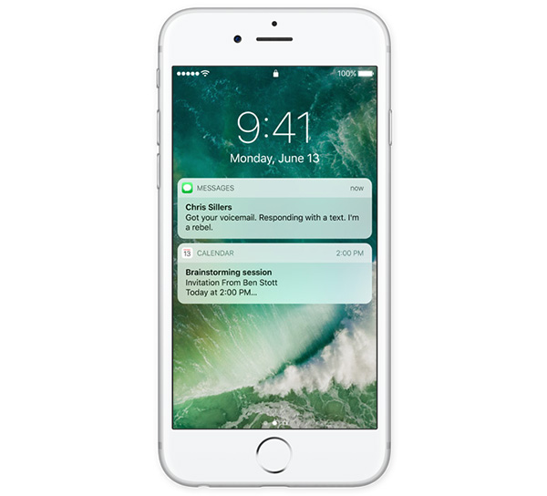
Well, it’s certainly different. In fact, it’s so different, I find myself locked out of my iPhone on worryingly regular occasions. The problem is, there’s no more Swipe to Unlock, you see. It’s gone, replaced with a page full of widgets that appear when you do the same swipe gesture we’ve been doing for almost ten years. There’s a lot of muscle memory there to forget, with a tap of the Home button now required if you have the audacity to wake the screen by pressing the sleep/wake button or rely on the Raise to Wake feature. Touch ID isn’t enough. A press is needed, and that just feels odd right now. Still, it’s early days. I shall persist.
Raise To Wake
Why oh why has it taken so long for this to arrive? I’m fairly sure HTC were doing this when Steve Jobs was a toddler. Apple finally caught up, and it’s lovely. Can we have something that let’s me double-tap the screen to wake it up now too, please?
The Whole Notification Center / Today View / Spotlight-Proactive Screen Move-Around
This is all very odd. It’s all down to muscle memory, you see. I’m very used to swiping down to see my widgets, but they’re not there anymore. They’re over on the left where Spotlight used to be. Granted, Spotlight was sort of replaced by Siri Proactive suggestions screen a while ago, but even now, I want Spotlight to be there. It still is, kind of, but the keyboard doesn’t come up automatically so pulling down is still the best way to get to Spotlight. That’s all fine, except I just can’t quite remember where everything is or which swipe gesture I need in order to access it. Time will heal all here, I’m sure. 24 hours isn’t a lot of time.
New Widgets
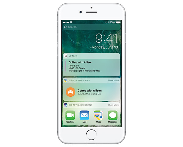
The way widgets are now displayed, with rounded rectangles as their background, looks nice depending on the wallpaper you use. They all seem to be fixed height, meaning anything with a larger widget, such as Fantastical, is truncated. Whether that’s something app developers can rectify or Apple is now going to force all widgets to be the same size remains to be seen. Let’s hope for the former.
Also, widgets are everywhere now. There are on the left side of the Home screen. And on the Home screen itself, they are one 3D Touch Quick Action away from apps that support widgets. They live on the left side of Lock screen as well.
Overall, I think I’m going to like the new widgets once I have all of my favorites back. The joys of early betas!
Photos
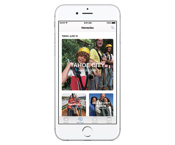
The new Photos can do facial recognition, just like iPhoto could all those years ago. It works better than those dark days, because it’s all automatic now, but it still feels like it’s lagging behind what Google is capable of. That may will improve with time, but given Apple’s refusal to do anything that might even be suggested as foul play as far as privacy is concerned, I’m not all that convinced. Will Photos be enough to make me trust iCloud with all the photos of my kids? Not. A. Chance.
Messages
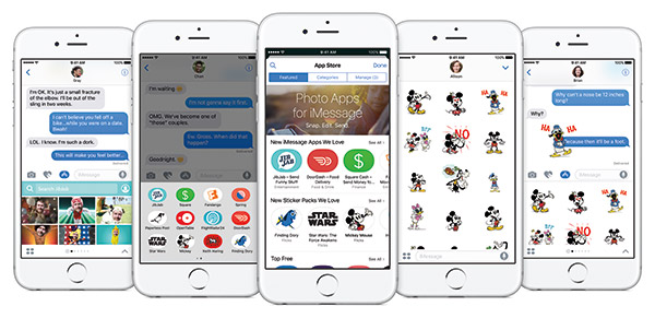
A lot of the new features are no good unless you know someone else with iOS 10, which I don’t at the moment. It looks like it has huge promise, though, and having animated GIFs right within the Messages app is something that feels strange. In fact, it feels like you’re using a different app or you’re jailbroken. It’s just…odd. But totally awesome, too.
3D Touch Is Everywhere
If you’re one of those people who’s says they never use 3D Touch, that’s going to change big time with iOS 10. Everything’s behind a 3D Touch gesture, and if I’m honest, I don’t know if I like it. Interacting with notifications, even to just reply to a message, now needs a 3D Touch rather than a swipe. It grows tiresome, quickly. Perhaps I just need time to get used to it. Perhaps I don’t.
There are other little things to note, too. The way the camera is now accessed from the Lock screen by a swipe to the left rather than a swipe up. So many of the little animations have been tweaked, like the way apps and folders zoom in and out – little things that you might not notice initially, but in the aggregate, make iOS 10 feel very much different to the version of iOS that came before it. That’s a good thing, of course, or at least it will be when we get used to it. Until then, though, there’s a learning curve to iOS 10. I’m only on the first step, though, so let’s see where some more steps take us.
Oh, and a word on stability. So far, I’ve had no crashes. Battery life is fine. Everything’s fine, until tomorrow, when my iPhone probably won’t work at all.
Betas, eh?
You may also like to check out:
- 60+ iOS 10 Hidden / Secret Features For iPhone And iPad [List]
- Install iOS 10 Beta OTA Configuration Profile Without UDID / Developer Account [How-To Tutorial]
- Download iOS 10 Beta 1 & Install On iPhone 6s, 6, Plus, SE, 5s, 5c, 5, iPad, iPod [Tutorial]
You can follow us on Twitter, add us to your circle on Google+ or like our Facebook page to keep yourself updated on all the latest from Microsoft, Google, Apple and the Web.

