When it comes to the look and feel of the OS, Android gives much more freedom to users as opposed to any other comparable smartphone operating system. You can theme, make changes through widgets, customize the boot animation, and pretty much change every aspect of the OS itself, all the way from the battery indicator to how the dock behaves (or even exists at all). In fact, the level of customization is so deep, that items like recovery and flashing of ZIP files through it have been given a proper, functional GUI as well (AROMA installer, for instance). The same freedom is also enjoyed by various manufacturers, who have, over time, developed a unique identity of their own through their distinctive Android UI skins. And the most popular one of them, by far, seems to be HTC’s Sense UI.
Whether Sense is the most practical and user friendly, not to mention aesthetically pleasing, UI or not, is debatable. However, it’s hard to argue that it is one of the most favored ones. Through the years, the Taiwanese manufacturer has uplifted the UI a lot, making it more practical and elegant, but the basic theme has remained kind of same. It seems that now, however, they’ve decided to adopt a different route, going for more sleeker looks that are space efficient, easy on system resources and generally more aligned with Android’s native UI. All of those you will get in Sense 5!


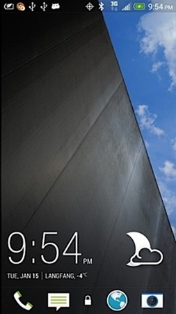
While Sense 5 is not available to general public just yet, XDA’s recognized developer, mdeejay, believes he has a working port of the new Sense skin, from which he has been providing image teasers to the XDA community (check out the full details at the source link below). If you look at the lock screen preview above, you’d notice there’s no longer a pull ring out there to play with, and the icons themselves have been made smaller. Then, the weather and time widgets are much sleeker and ‘plain’, giving a more minimalist look to the over all user interface. While I don’t find this a very welcome change, most of the users seem to think otherwise.
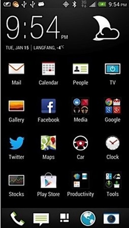
Below you’ll find a preview of what the home screen would look like. Again, a lot of fancy, animation-heavy elements have been removed, and replaced with the same leaner widgets that we noticed on the lock screen. The icons, too, have been changed a bit.

Sense 5 is going to be HTC’s latest rendition of their famous Android UI skin, and by the looks of it, will be received quite positively when it’s released. Unfortunately, we don’t have any update on what devices will be receiving this, but we can safely assume that the newer ones would definitely make the cut.
(Source: XDA-Developers forum thread)
You can follow us on Twitter, add us to your circle on Google+ or like our Facebook page to keep yourself updated on all the latest from Microsoft, Google, Apple and the web.

