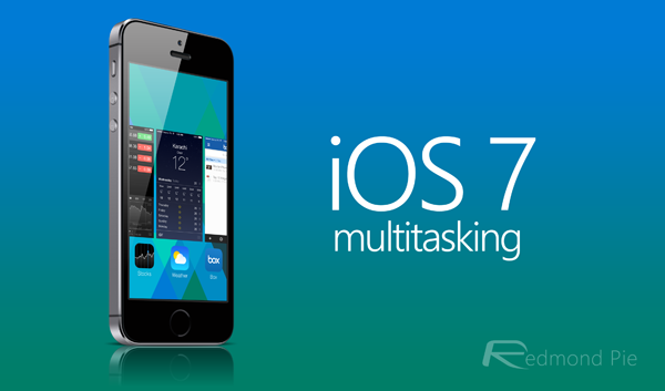
Of all of iOS features, multitasking has perhaps come along in the greatest strides since its introduction with iOS 4, and while the latest iOS 7 has been noteworthy for its aesthetic tweaks and genocide against skeuomorphism, it has to be said that the multitasking feature is looking a great deal more complete than it ever has before. The card interface provides novel previews of the app in its current state, making it easier to spot which ones still require your attention, but while you may have thought the new multitasking was slick and snappy, there’s actually a way to speed things up further.
Prior to the September arrival of iOS 7, multitasking in Apple’s mobile OS was a great deal behind that of Google’s Android. Not only was it too simple, but the functionality was generally poor, and of all the more recent implementations to iOS, multitasking seemed more like an early Alpha than the primed and finished product.

But things have now most certainly changed for the better, and as well as offering more by way of usability, it’s also very easy on the eye. But while the preview cards make for a comfortable virtual swiping experience, there’s actually a speedier way to flit between these different screens.
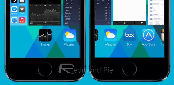
See, while the big revamp means you no longer have to swipe those piddly little icons any more, by gesturing left or right over the icons rather than the preview cards, things seem to speed up considerably.

Yes, it may mar the experience slightly if you’ve recently accustomed yourself to swiping over the cards, if you can break this habit and swipe over the icons below, then you will actually get the job done quicker.
The video below shows just how things become a little more fluid simply by using a different area of the display to swipe. There’s no particular rhyme or reason behind it, but it’s hard to argue with the solid evidence, and having tried it ourselves on multiple devices, it’s definitely a legit tip.
Try it on your iOS device, and see if you notice any difference in speed. Obviously, results will probably vary depending on which iDevice you own and how old it is, but if you like to keep on top of your open apps, you’ll be much better off navigating with the icons than the cards.
(via: Reddit)
You can follow us on Twitter, add us to your circle on Google+ or like our Facebook page to keep yourself updated on all the latest from Microsoft, Google, Apple and the Web.

