In keeping with the recent trend of user-experience and thanks to some minimalistic and beautiful weather apps, it is quite fitting that MinimalWeather has come into the public eye recently thanks to the power of the Twitter micro-blogging platform. Gone are the days of the overloaded mobile interface which brought stacks of information and text to read. Long live the minimalistic approach to mobile user interface design.
When talking about extremely minimalistic weather experiences, it doesn’t really doesn’t come any more basic that the MinimalWeather.com website. The main homepage of the site is simplicity itself and pulls the current location from the hardware sensors of the iPhone or iPad. When the location has been acquired, the site quickly produces the temperature in big bold numbers and the relevant and minimal icon that goes alongside the current temperature to offer a graphical portrayal of the local weather.
On first glance, the power of the website seems pretty straight forward. An HTML5 and JavaScript based website that hooks into the device and then renders an output based on the location information that it receives back. In essence, that is pretty much exactly how the website works, but it also packs a little twist into its arsenal and is something that becomes immediately evident when viewing the site on an iOS device. Mobile Safari immediately produces a pop up on screen which asks the user to press the action button and then add the web app to the device’s home screen for quick and easy access.
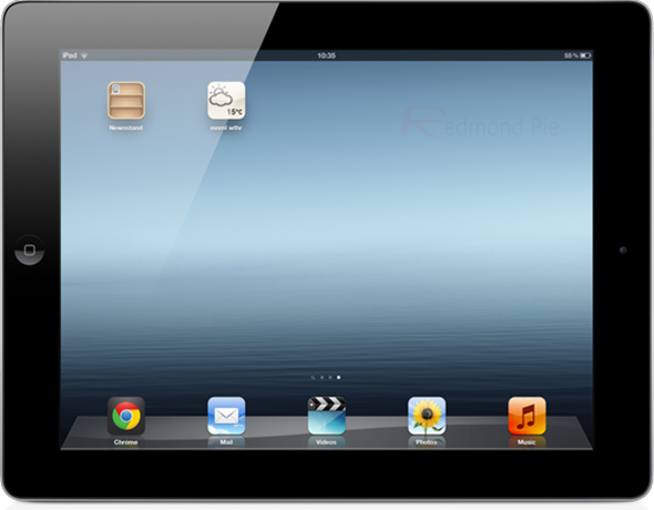
The awesome thing about MinimalWeather is that when the app is added to the home screen, the icon that is added with it displays the current weather information that had previously been displayed within the main interface. Every time the app is launched, the icon updates to the current conditions therefore effectively being a semi-live and self-evolving home screen icon. Updating the icon and providing this interactive app launcher is made possible thanks to the link rel=’apple-touch-icon’ functionality which Apple provides. It is basically Apple’s way of allowing developers to set a favicon-type image that is displayed on the home screen when a website is added as an app.
The developer in question, elcuervo, started out with a basic site that was built around HTML5, JavaScript and some fancy customized fonts to make the interface look attractive and appealing to the user. Unfortunately, due to rendering issues and slow performance times, the site had to progress and change behind the scenes. What started out simple ultimately turned into a site built around a Cuba backend, with custom typography conversions and a reliable forecasting partner to get the weather forecasts perfect. When all put together and mixed with a lot of information caching and avoidance of certain JavaScript libraries, the very beautiful and very awesome MinimalWeather.com site is born.
The site works great in a desktop browser for local weather thanks to browser-based geo-location features but the real power is felt on an iOS device. Head on over to the site now and check it out for yourself. Don’t forget to add to the home screen to experience the full effect.
You can follow us on Twitter, add us to your circle on Google+ or like our Facebook page to keep yourself updated on all the latest from Microsoft, Google, Apple and the web.


