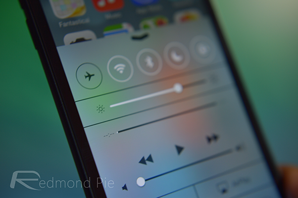
Yesterday, Apple seeded iOS 7 beta 2 to developers. The biggest news to come out of this release was the addition of iPad support, for which we’ve already done a full video overview, however there was also a plethora of smaller additions into the betas for iPod touch and iPhone.
Whilst none of the additions included into the iOS 7 beta 2 upgrade match that of a fully functional iPad variant, there are definitely some nifty little tweaks and adjustments to the OS which definitely require a look in.
As such, we’ve produced a full video walkthrough of the more notable changes in the video embedded at the end of this article.
The biggest thing to come out of beta upgrades to in-development software, is general smoothness and stability improvements. Whilst I was pretty happy with how iOS 7 beta 1 turned out, if there was anything it needed improvements with, it was general navigation lag and overall quality of user experience. Of course, I was aware that iOS 7 is still beta software, so I didn’t worry about it too much, but the nag was still there in my mind. I’m happy to report that most of my complaints for general lag and holding of the user interface are now long gone, and I’m sure that it will only improve when we see iOS 7 beta 3 in a couple of weeks.
There is a huge list of tiny additions in iOS 7 beta 2, however most consist of very small user interface additions that slightly tweak the user experience. The video below focuses on the more meaty of the changes supplied in beta 2, as they tend to be slightly more interesting. Something that strikes me as very prominent, is the movement of Siri’s voice to something that sounds more natural, and less robotic. This clearly indicates that Apple is moving towards Google Now’s methodology for a personal assistant, and are moving away from the clear distinction between robot, and human imitation.
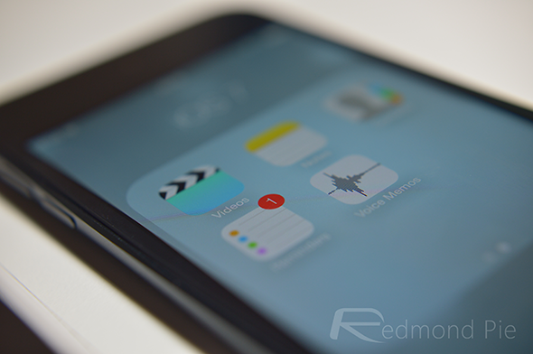
This all being said, I’m extremely excited to see what changes come in the future betas of iOS 7. There should be many more changes, additions and improvements to come, and you can be sure that we’ll be covering all of them here on Redmond Pie. For now, if Apple takes anything away from any of this, just please, please change the Voice Memos app icon.
Subscribe to our YouTube channel for more videos.
You may also like to check out:
- Video Overview: iOS 7 Beta 2 For iPad And iPad mini
- Download iOS 7 Beta 2 For iPhone 5, 4S, 4, iPod touch 5 [Devs Only]
- iOS 7 Download: Beta 2 Released For iPad And iPad mini As Well
You can follow us on Twitter, add us to your circle on Google+ or like our Facebook page to keep yourself updated on all the latest from Microsoft, Google, Apple and the web.


