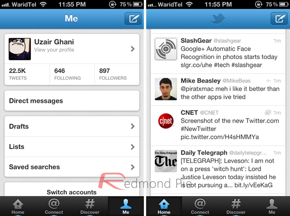
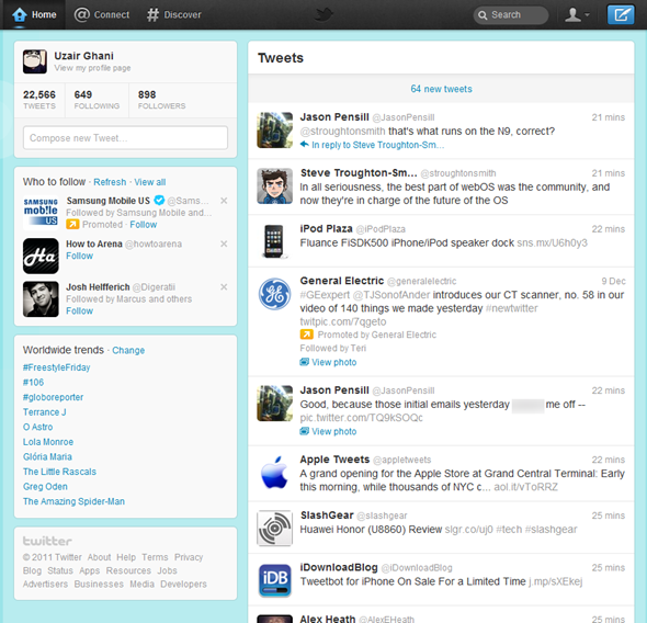
If you’re an avid Twitter user like the most of us here at Redmond Pie, then you’re probably aware that yesterday was a big day over at Twitter HQ when they rolled out some major changes to their web interface and mobile apps.
The Twitter for iPhone and Android apps were completely revamped, and are now at version 4.0 and 3.0 respectively. The update in our opinion was quite extensive, and a much needed one as well. The two most noticeable changes that came along with the update included faster refresh times and a whole new UI.
With the new redesigned UI, the way tweets are now displayed has been revamped, but unfortunately, this change also means that one of my most used feature, the swiping gesture, has been removed from both the iPhone and Android apps. So yeah, disparity tagged along the way when it was raining in heaven.
Moving away from the native apps; both the desktop and mobile web interfaces got a revamp, too. In all honesty, its brilliant now, and is somewhat easier to navigate than the previous version.
The new web UI is cleaner, and much more faster than ever before. But, I am personally missing the side-pane which previously used to show more details about a tweet when it was selected.
The tweet composer is now a dedicated button which sits on the top bar of your Twitter page. It allows you to send tweets painlessly from anywhere within Twitter site. Once you click the compose button, the compose window will pop-up, as seen in the screenshot below:
Twitter is currently said to be rolling out the new interface region wise, which unfortunately means that many international users will have to wait for their turn to get the taste of the new, and so called, #NewNewTwitter web interface.
But what if you want it now? Well, there are no funky steps to follow, no developer commands to punch in, simply: install the Twitter for iPhone or Android app, sign-in and presto! You will automatically get the new Twitter web-interface.
You might also want to check out this official video walkthrough on the new Twitter design:
So then, what are you waiting for? Give it a shot and let us know if it worked for you!
You may also like to check out:
(via Gizmodo)
You can follow us on Twitter, add us to your circle on Google+ or like our Facebook page to keep yourself updated on all the latest from Microsoft, Google, Apple and the web.


