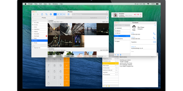
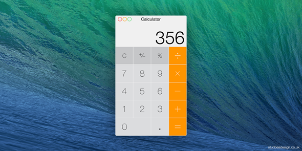
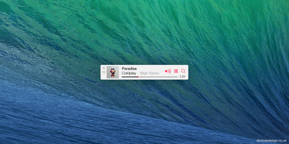
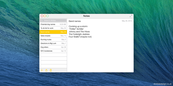
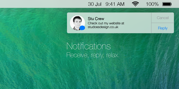
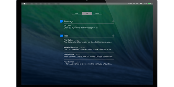
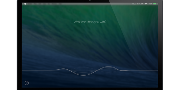
With Apple currently in the process of developing a bunch of new software products ready for release later on this year, the technology industry has been looking on with great intrigue. iOS 7 has, quite naturally, dominated the headlines, but OS X Mavericks 10.9 is also clocking up its fair share of preview releases ahead of its own debut, which should come significantly earlier than its mobile-tailored counterpart. In recent times, we’ve seen Apple bring quite a few of iOS’s features over to its desktop OS in what has been dubbed an “iOS-ification,” and whilst the changes to Mavericks don’t seem to bear as many iOS hallmarks as Mountain Lion, designer Stu Crew has tried to paint a picture of what OS X Mavericks could look like if given the same design makeover as iOS 7.
With iOS having come under fire in recent years for being too safe, lacking innovation and generally failing to improve, the onus was certainly on Apple to deliver the goods with iOS 7. iOS 6 was shrouded in controversy thanks to the shoddy Maps app that Tim Cook’s men had displaced Google Maps for, and it was a rueful misjudgment that saw the head honcho himself forced to pen an open letter of apology.

The result has been Jony Ive’s vision of iOS, and while the new-found flat shapes and cleaner all-round look has divided opinion, it seems the days of skeuomorphism – at least, on iOS – are long gone and forgotten within the walls of Apple HQ.
But surely, being a company of uniformity, OS X will take on a similar look? After all, iMessage, iBooks, Reminders, Game Center and Notification Center have all found a home within the desktop ecosystem, and while OS X doesn’t appear to be getting a radical overhaul just yet, having apps looking completely different on desktop versus mobile just doesn’t seem like the Apple way of doing things.
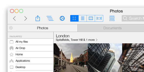
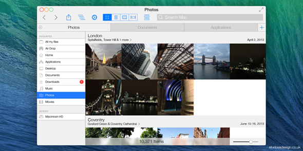
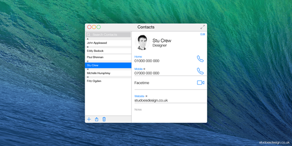
As the fruit company continues to go soft on the UI changes to Mavericks, Stu Crew’s “Ivericks” concept shows how it the forthcoming version of OS X could look if Jony Ive were to give it the same kind of attention he has iOS 7.
Check out the images below, and let us know in the comments whether you’d be happy if Apple made these kinds of alterations:
(Source: Studoesdesign)
You can follow us on Twitter, add us to your circle on Google+ or like our Facebook page to keep yourself updated on all the latest from Microsoft, Google, Apple and the web.

