With Jony Ive offering his very highly-regarded input to the next major iOS release, many Apple enthusiasts are expecting some significant improvements when the company’s mobile software does get its big update later on this year. We’ve already been treated to a deluge of iOS 7 concepts and ideas by numerous designers from across the globe, and adding to this list comes an interesting video / image set alluding to iOS 7 from a designer under the Flickr handle F.Bianco.
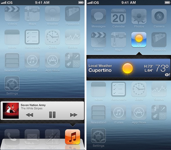
The concept seems, for the large part, to maintain the basic look and functions of iOS 6, but also introduces pop-out boxes in order to accentuate the content and offer additional information / controls. For example, when hitting on the Calendar app, a box appears in an animation similar to the opening of a folder, and reveals an actual calendar within.

Contents of these boxes / folders are described as "widgets", but although the idea is certainly noteworthy, the result is actually a more cluttered-looking home screen. In another instance, the App Store app reveals a dropdown including all apps in need of updates, and while this is a novel idea, the folder-opening animation only makes things look uninteresting and lacking in dynamic. Moreover, the background uses the same, skeuomorphic look on the OS X widget board, and all of those memories of what a graveyard it is come rushing back.
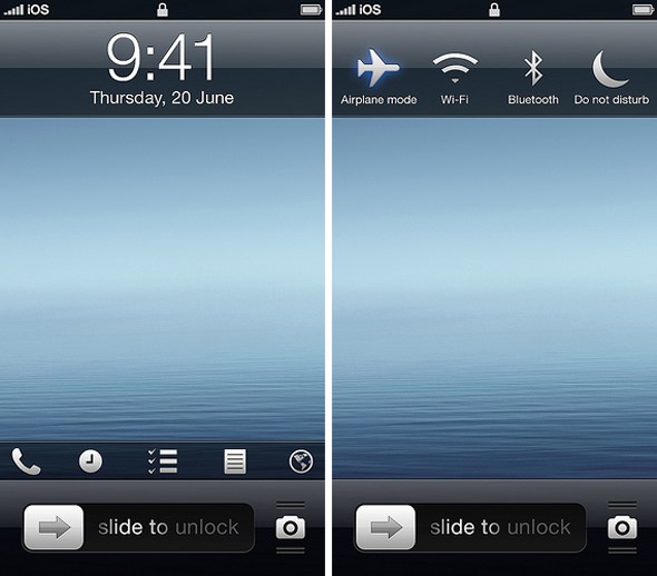
On a brighter note, the new-look lock screen is actually rather inspiring. A sideways swipe across the time and date reveals toggles for Airplane Mode, Wi-Fi and others, while the camera shutter button can also be changed to help you leap into other areas of iOS you may urgently need to consult, such as the Phone, Clock, or Reminders.
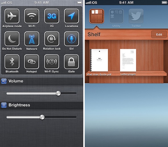
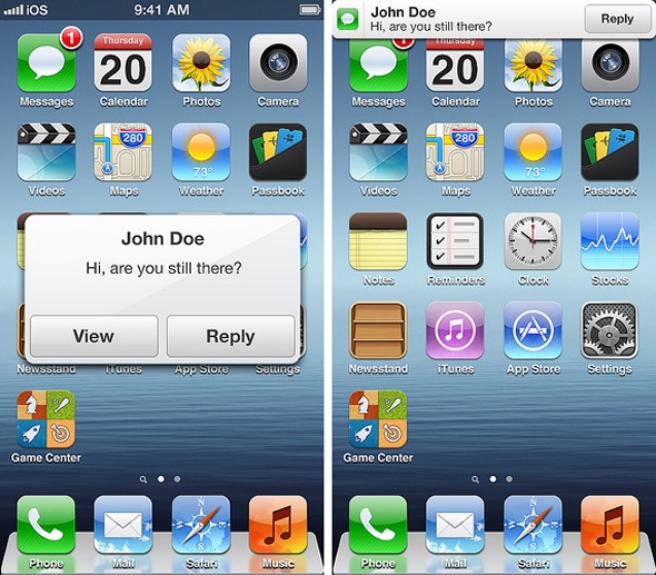
The best feature of this concept, is, in my humble opinion, the Quick Reply, which works on the home screen, lock screen, and presumably, in-app as well. As a long-time user of BiteSMS (a feature-rich jailbreak app replacing the native Messages), it’s one of the only features I cannot live without on a non-jailbroken device, and the sooner Apple brings in this kind of implementation, the better.
Having seen the video clip of the concept, which features are your favorites? Would you be happy if this were Apple’s iOS 7 demonstration? Please do leave your thought below in the comments section.
(Source: Flickr) Thanks, Marco for the hat tip!
You can follow us on Twitter, add us to your circle on Google+ or like our Facebook page to keep yourself updated on all the latest from Microsoft, Google, Apple and the web.

