Google’s Gmail has, in its decade-long tenure, established itself as one of, if not the foremost service for managing virtual mail. The Gmail team has worked to ensure that users have a robust and secure platform from which to keep track of the continual cycle of digital correspondence, and according to some newly-leaked info, the Web app is set for a significant overhaul that will incorporate a totally new design. Screenshots, as well as further details, can be seen below.
During the past couple of years, there’s been a concerted push by Gmail’s developers to ensure that the mobile apps are up to scratch. The Web service has been modernized to a degree, and is undoubtedly more functional to boot, but apparently, there’s a lot more to come.
Info gathered by the folks at Geek.com, which is also backed up by some tasty-looking screen captures, shows how Google may be planning to do away with the current tab bar along the left side, incorporating a drop-in menu in its place. It’s a smooth, modern approach that takes on board the Windows 8 idea of keeping menus hidden when not in use, and this, in turn, frees up space and gives an overall feeling of minimalism.
On the right-hand side, there’s a Hangouts pane, which can also be collapsed / expanded at the convenience of the user, and even though Gmail, at its current duration, isn’t exactly crying out for improvements, we’d certainly welcome changes to this effect from the search company.
As far as full-screen Gmailing is concerned, this look would definitely suit, and with better categorization to boot, it would be a lot easier for a user to scan over their emails at-a-glance.
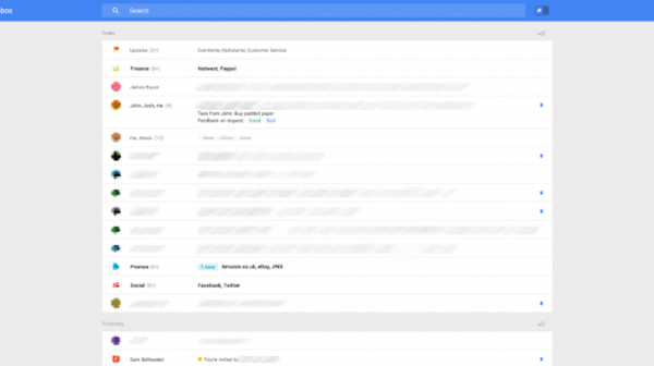
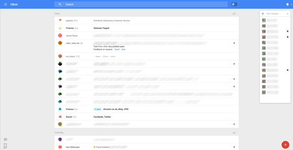
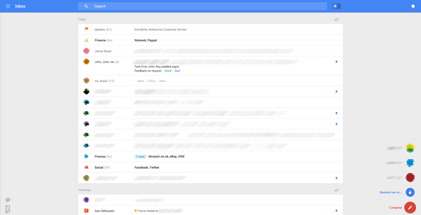
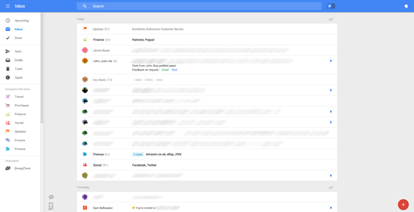
It’s not uncommon for some folks to receive hundreds of emails a day, and without an effective way of managing them, things soon build up to unmanageable levels. With this new and improved system in place, which also includes a pin system to replace the current starring of important email, you feel that some of these features could make the task of emailing a whole lot less cumbersome.
What do you make of this prospective new look? Be sure to check the screens and share your thoughts below in the comments!
(Source: Geek)
You can follow us on Twitter, add us to your circle on Google+ or like our Facebook page to keep yourself updated on all the latest from Microsoft, Google, Apple and the Web.

