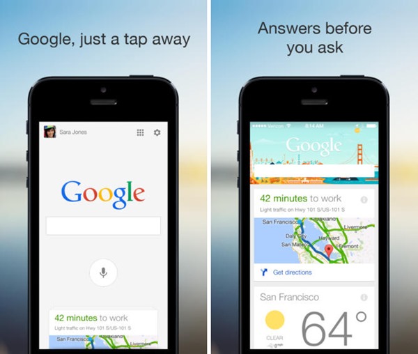
Apple’s massive redesign of the look and feel for iOS with the 7th iteration of the operating system inspired a lot of users to adopt Apple’s design schema, akin to what we saw with Android’s Holo user interface. While it makes sense for app developers to do that in order to provide a consistent experience to users, competitors are usually slow on the uptake. Still, Google has finally decided to update its Search app for the iPhone and iPad, giving a synchronous look with iOS 7 design elements and making the experience full-screen natively. Let’s take a look at what the redesigned app has to offer.
To begin with, the Search app now runs full-screen natively, which means that as soon as you launch the app on your iPhone, iPod touch or iPad, it will hide the status bar and cover the entire screen real estate. Then, when you swipe to pull up Google Now, the status bar reappears, which indicates that there might still be areas to extend the experience further to. However, Google Now cards themselves are fully stretched now, spanning the width of the screen for each individual card.

Next up is a deeper integration with Google’s Maps app for iOS. If there are any deeper implications, we’re not sure, but one thing evident from the get go is that Maps search results are pulled much faster from within Google Search, with the option to toggle to the native Maps app (if installed) through a transparent button in the top right corner. This is ultimately useful for when you look up some directions within the Search app and want to get route options. Then, within maps, since they’re loaded with Google Search (so to speak), you have the ability to jump back to Search app right from within Maps. Trivial and small, yet very neat to have.
Finally, and this one is specific to the iPad, where Google has added the ability to search for images within the Search app, eliminating the need to fire up your browser (or Google Chrome, if installed) and find snaps that you want to take a look at. Again, it might not be something big, but one that users would definitely appreciate having.
Google Search for iOS update indicates that the company is heading in the right direction with promoting its user base on its biggest mobile/tablet platform competitor, and at the same time, providing a similar experience for both Android and iOS. We appreciate that, and look forward to having more along the same lines.
(Download: Google Search for iOS on the App Store)
Be sure to check out our iPhone Apps Gallery and iPad Apps Gallery to explore more apps for your iPhone, iPad and iPod touch.
You can follow us on Twitter, add us to your circle on Google+ or like our Facebook page to keep yourself updated on all the latest from Microsoft, Google, Apple and the Web.
