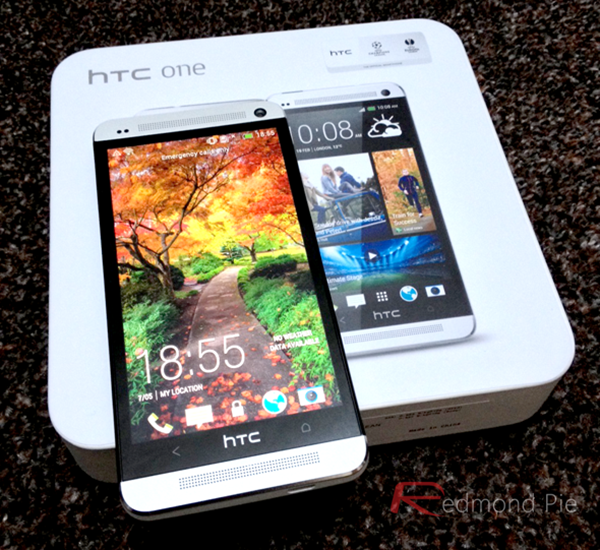
Before I dare utter another word, I’d like to make it known that when it comes to the battle of the mobile ecosystems, I’m completely impartial. I love iOS, iPhone, and Apple products in general, but there’s something about Android, namely Android smartphones, that always has me flirting with the likes of HTC One, among others. There’s no doubt, at least, to my mind, that Tim Cook and his team have pushed a pivotal piece of software in iOS 8, adding a number of features that many have long since pined for, but there are still some features that I really miss whenever I’m using an iPhone.
I’m sure I’ll get some abuse for this; I’ve been called a biased, rotten scoundrel fanboy (insert expletive here) many a time by the wonderful souls who take the time out to email me, so I can handle it, and hey, if you do have an opinion on this matter, you can drop me a mail or simply leave your thoughts in the comments.


Right, without further ado, let me quickly jot down my top five most loved Android smartphone features, which, depending on how you look at it, could also be received as my five major gripes with the iPhone.
1. Physical Back and Menu Buttons


When I first picked up my HTC One M7 last year – you may remember, I made a bit of a thing about it during those first few weeks – it did take me a while to get used to having the back button, which was placed conveniently within thumb’s reach rather than in the top-left corner á la iOS. But now, I’m an ardent fan of this system, which makes a little more sense in terms of everyday functionality.
The counter argument, of course, is that the iPhone 6 uses almost every millimeter of the face for the display, but Apple needn’t actually place physical buttons on the device itself.
Instead, such a feature could be coded into iOS, presenting users with the option of a few action keys along the bottom, and although I’m probably clutching at straws in hoping that such a feature will be added any time soon, it’s one that I truly believe would enrich the iPhone experience in general.
2. A Notification Light
On my old spare phone, an un-namable LG with generally ghastly functionality thanks to its lack of processing power, one quirk I always appreciated was the multicolored notification light. If somebody pinged me a message, I could set it as green for, say, WhatsApp, blue for Facebook messages, and red for those rarest of Google+ notifications. At a glance, I’d know which app the incoming message was coming from, and thus, have a vague idea of its importance.
A subtle light around the Touch ID button would be a perfect location for such a feature, and with an undeniable level of “cool” factor, is a plausible upgrade for a future generation of iPhone.
3. Custom Launchers
One of the things that really irks me about Android is that, depending on your device, manufacturer or model, you can be met with a completely different experience from handset to handset. But a quick trip to the Play Store and one download of Smart Launcher later, and I’m back on my feet – enjoying a mobile experience that I personally find more comfortable, fluid, and suited to my needs than stock Android, iOS, or even Windows Phone.
Apple’s home screen has become iconic, and if custom launchers came into play, it’d lose a bit of its identity. With that said, it would be epic if we could morph iOS into something better meeting to our individual requirements, and as such, I hold out very ambitious hope that this will occur in a future update.
4. App Management
When you slip through to Settings on Android and check out your apps, you have much more jurisdiction over your setup than you could dream of on iOS. You can readily kill an app, clear data, and notably, manage defaults, meaning that if you do want to use Firefox, say, instead of Chrome, Google isn’t going to get offended by it.
The app management benefits on Android only really hit home recently, when Google rolled out a new Materially-Designed Messages app to replace the native Hangouts and Messages. After using, of course, my custom launcher to hide those aforementioned utilities, I quickly set Messenger as the default, and since then, I have all but forgotten that those apps I don’t use even exist. If I had such powers on iOS and iPhone, it’s fair to say that I’d have less reservations about using one as my daily runner.
5. MicroSD slot
Yep, sure, this is a bit of a cynical one, and the kind of suggestion that will never become a reality, but as idealistic as it may be, I’d love the flexibility of removable storage.
I know full well that Apple’s long-standing ethos of delivering only on-board storage is a testament to iOS’s seamlessness, but with high grade flash storage available so cheaply nowadays, it would certainly be nice from both an expansion-of-storage and a versatility aspect.
With a 128GB model iPhone 6 / 6 Plus now here, there’s always that, but with the cost of the priciest iPhone 6 Plus running you dangerously close to the $1,000 mark, those in search of breathing room are paying one heck of a premium for the privilege of doing so.
So, those are my five most enjoyed features of Android that I miss whenever I’m using an iPhone. I could have gone on – multiple users and split-screen multitasking, to name but a couple – however these are the major areas that affect me on a personal level.
As I said before, I’d love to hear your feedback, and yes, in order to keep things fair, I’ll also be producing a similar article on a few features that iOS users can legitimately laud over Droidsters as well, so stay tuned for that!
Disclaimer: The views expressed in the post above are my personal views and don’t represent that of my employer Redmond Pie.
You can follow us on Twitter, add us to your circle on Google+ or like our Facebook page to keep yourself updated on all the latest from Microsoft, Google, Apple and the web.
