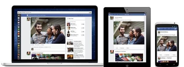
For the longest of time, Facebook’s most prominent feature has been the News Feed, which is now the default way that many of us stay in touch with our friends and acquaintances over the Internet. At an event on Thursday, from Facebook’s headquarters in Menlo Park, California, Mark Zuckerberg took the stage and announced a major redesign to this well-known feature in order to adapt to make pictures, places, third-party apps and more much more prominent.
The focus of this redesign is to replace the overwhelming amount of text already present in most people’s Facebook feeds with images, whenever possible, creating a prettier view that is also much easier on the eyes, replacing a stream of text with what Zuckerberg describes as a “personalized newspaper”. In the updated News Feed, photos take center stage and are now displayed in a much larger size. This change does not only apply to photos directly uploaded onto Facebook but pictures from third-party apps as well, such as Facebook-owned Instagram. Those who enjoy photography, or just having a quick glance at what their friends were doing while you were working, should very much enjoy this change. Places, videos and news articles are also displayed more prominently, as well as, unfortunately, advertisements.
Another important addition is the choice of feeds, with filters displayed on the sidebar: “All Friends” displays all recent friend activity in chronological order, “Photos” which displays all recent photos, “Music” which displays concerts taking place around the area that have received the interest from friends, along with many other filters that allow an increased amount of information to be narrowed down into what matters to the user at the present time. Priority will always be given to friends within lists, as well as family members. There are also a few new sections in the upgraded News Feed, such as “Upcoming Events”, which gives users a quick glance at events that will be attended by friends without having to navigate over to a cluttered “Events” section.
Facebook’s main goal with this change was to unify its web, tablet and smartphone layouts, which while familiar, are actually quite different under the hood. By greatly simplifying the web design, the News Feed will now look identical on all platforms and screen sizes, creating a much more consistent and familiar experience. As pointed out by the designers at the social network, having the same design work across all possible screen sizes is “the dream of every designer”.
Starting today, Facebook will begin rolling out the new design to web, starting with a limited range of users in order to conduct some initial testing. If you wish to try out the new News Feed first hand, here is how to do it:
1- While logged into Facebook, navigate over to facebook.com/
2- Simply scroll down and click on “Join Wait List”.
If you join the wait list quickly, you will be one of the first people to enjoy the new layout. Otherwise, it may take a few weeks for the improved News Feed to show up. Nonetheless, it is Facebook’s intention to roll it out to new users over the coming weeks, first to both the web and iOS devices, and later to Android and all remaining major mobile platforms. It’s Facebook’s hope to complete the whole rollout within one month.
You can follow us on Twitter, add us to your circle on Google+ or like our Facebook page to keep yourself updated on all the latest from Microsoft, Google, Apple and the web.

