The Google Glass Explorer program has been running for the best part of a year now, and although the designs are still in the process of being tweaked, the progress that has been made since the start of Project Glass is really quite something. Despite this week’s I/O conference has largely avoided the topic of the head-mounted device, the Big G did take the opportunity to showcase several prototype models in something of an evolutionary exhibition. Given that we’re in attendance at I/O this week, we couldn’t resist taking a few snaps, and below, you can see first-hand just how much progress has been made on Glass’ design over the past few years.
Although Glass was only really introduced to the world early on last year, Google had already been working on the project for quite a while, and even though some have criticized the design for its lack of style and general consumer appeal, the strides that have been made in the short lifespan of Glass suggest that we may have been a little harsh on this still-emerging technology.
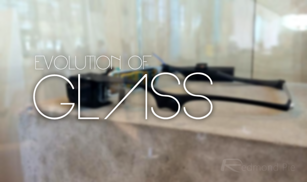
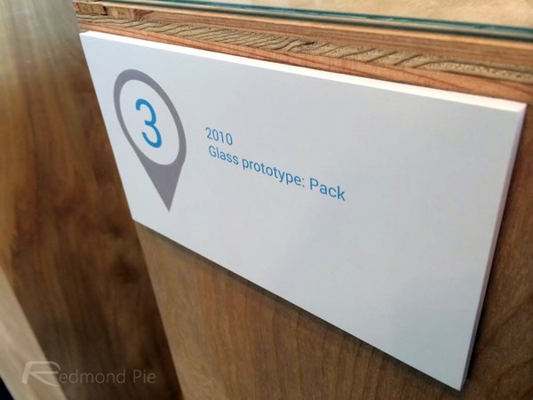
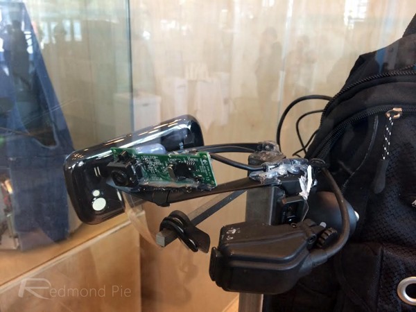
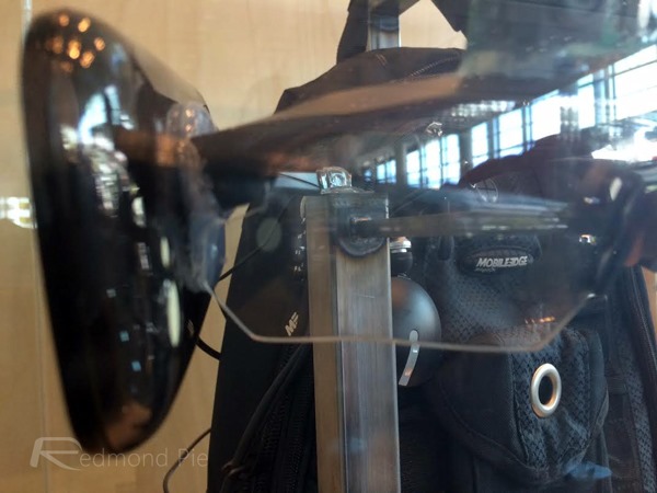
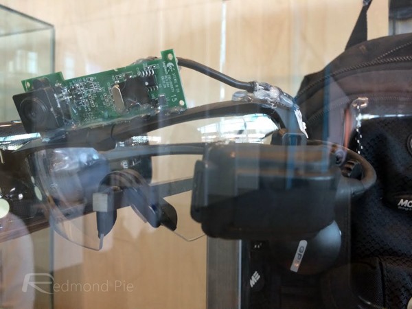
Google Glass ‘Pack’ Prototype (2010)
All the way back in 2010, Google came up with Pack, a prototype model of Glass that looked, to all intents and purposes, like a pair of regular spectacles laden with numerous gadgets in something of a home-made job. Given how experimental Project Glass was back in 2010, this is to be expected, although anybody who has dismissed the current edition as “ugly” really ought to check out this beast:
Google Glass ‘Cat’ Prototype (2010)
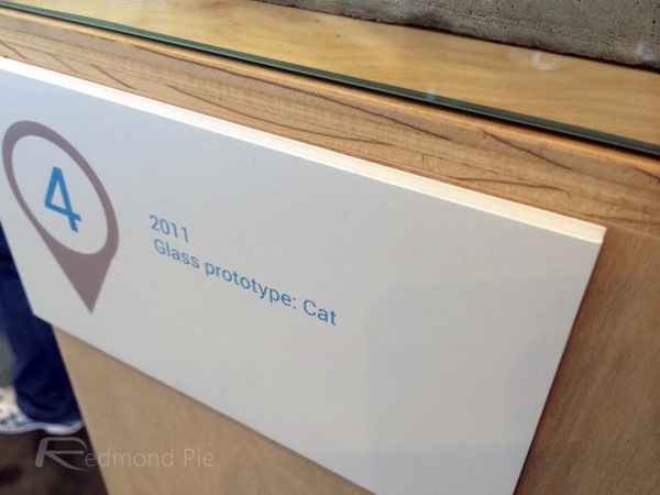
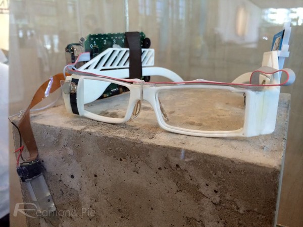
Things got marginally better in 2011 with the introduction of prototype Cat, which, at least, slimmed things down a tad. It still looked very much like the work of a small child, mind, and as you can see, continued to lack in the style department:
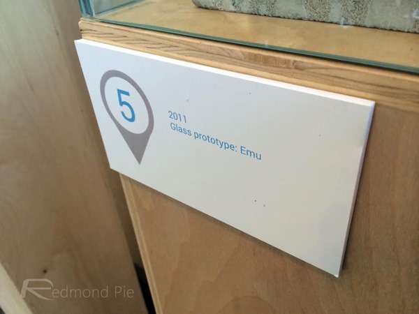
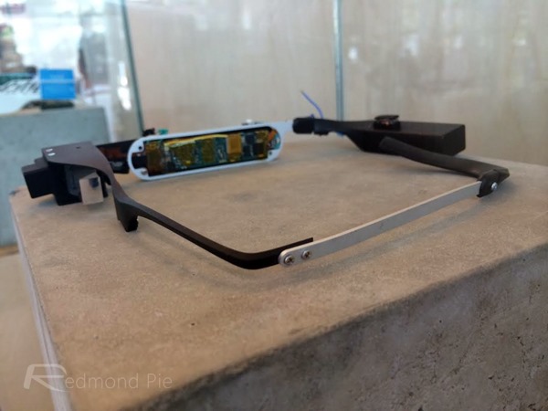
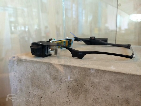
Google Glass ‘Emu’ Prototype (2011)
Later on that year, the Glass team really seemed to get it together with the Emu prototype, which revealed the first signs of the profile we see today with the Explorer Edition. Work was done to give the device a more palatable aesthetic, and although it was by no means the finished article – it still isn’t, after all – it was a marked improvement on those prototypes before it.
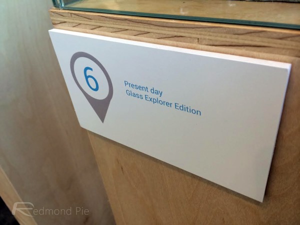
Present Day – Google Glass Explorer Edition
All that design and engineering work brings us to the present day – the Explorer Edition – and with those old prototypes offering a vivid sense of perspective, suddenly the current model doesn’t feel like such an eyesore, right?
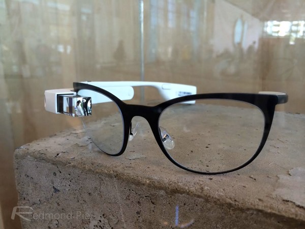
Whatever your opinions of Glass may be, it cannot be denied that Google is on the cusp of something potentially game-changing, and even if it’s not ready for the consumer market, various fields including police forces, doctors, and enterprises look ready to swoop once Glass finally shakes off that beta tag.
You may also like to check out:
- Google Glass v2 Unboxing And Quick Hands-On [Photo Gallery]
- The Evolution Of Google Glass In Two Years Since Its Inception [Image]
You can follow us on Twitter, add us to your circle on Google+ or like our Facebook page to keep yourself updated on all the latest from Microsoft, Google, Apple and the Web.

