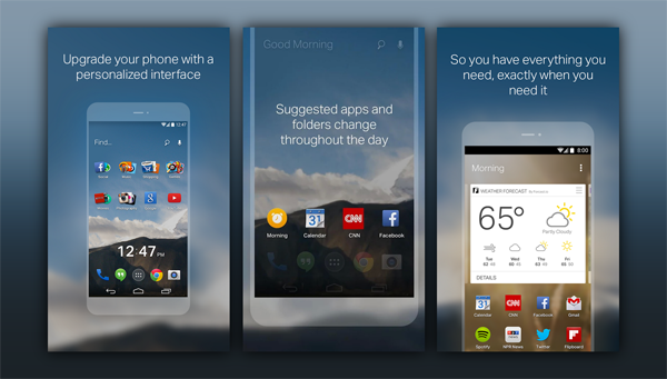
The most enjoyable aspect of using an Android, at least for me personally, is the fact that the entire experience and be flipped on its head by simply downloading and installing a new launcher. EverythingMe is one such home screen alternative, and although it has been in beta for quite a while – an entire year, even – the launcher has now been rolled out as an official, complete package. On first inspection, it has definitely been worth the wait, and if the idea of an intuitive, search-centric launcher appeals to you, then be sure to catch the details after the break.
Apart from checking up on email and other such correspondence, one of the first things we always do when picking up a smartphone, tablet, or logging into our desktops, is to perform a search. Whether it be Web-based or one of those tedious quests to find a lost file / folder among the local disorganization, we’re forever searching for stuff in this modern Digital Age.

Recognizing this, the creators of EverythingMe have tried to create something that facilitates our incessant need to find things in a swift, efficient manner. But while everything was staunchly search-based in the beta, the developers have now added a degree of context to proceedings, meaning certain functions will adapt depending on where you are, what time of day it is, what’s coming up in your schedule, and so on.
Its smart system tries, and often succeeds, to adapt to your daily life, acting accordingly upon what it has managed to surmise from the info you feed your device every day.
For example, if you wake up and regularly check the news, EverythingMe will learn to show you the latest headlines ready for that time in the morning. If you spend a lot of the day shopping online, perhaps the launcher will prepare you by throwing up the Amazon app on your daily panel. And if you love nothing more than to sit down in the evening with a good book – or at least, a digital book – then EverythingMe will pick up on this and adjust its interface so you don’t have to go looking for the relevant apps.

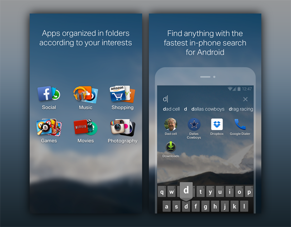
As well as the context-centric theme, the launcher also includes Smart Folders, which present contextual info in a beautiful, card-like interface. As you can see from the screenshots, depending on the category of said Smart Folder, EverythingMe will throw up all kinds of information on these cards, and everything happens in an automated fashion.
For example, your news folder will aggregate the top news channels trying to curate a list of the stories you want to read. Up to a maximum of five, you can then effortlessly slide through the cards via gestures, quickly catching up on the headlines without having to manually find your favored apps and scan through stories to find the ones you wish to read.
There’s plenty more to enjoy besides with this very thorough launcher, as you can see from the video below:
EverythingMe is available for free, and we’ve embedded the direct link for you below. If you’re looking for a way to make your device better work for you, you’re unlikely to find a more refined experience than this, and after more than a year in beta, the amount of work that has been put into its preparation is very obvious from the point of installation.
(Download: EverythingMe for Android on the Play Store)
Make sure to check out our Android Apps gallery to explore more apps for your Android device.
You can follow us on Twitter, add us to your circle on Google+ or like our Facebook page to keep yourself updated on all the latest from Microsoft, Google, Apple and the Web.

