One of the most influential designers in the team behind creating the look of Windows 8, has showcased several early concepts which advanced into the look we see today. Marius Bauer’s area of expertise was in the Start and lock screens, and notes of how designing wallpapers for Windows 8 was something of a "dream project" to him, and as you’ll see below, the designs themselves paint pictures of somewhat dreamy, entrancing atmospheres.
Bauer liked the idea of keeping things simple and clear on the Start screen, with the design elements really shown-off on the comparatively-clear lock screen. Take a look:
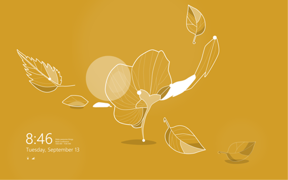
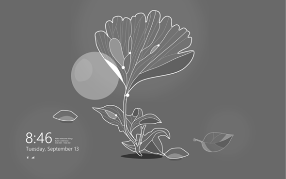
Inevitably, some will argue that the old look was better, but I believe that’s just the way of the world. The new look is, to many, still a source of frustration to those whom saw nothing wrong with the old style of Windows, so it’s only natural that the current style loses out by affiliation. In my opinion, the early concepts look nice, but as do a large portion of the wallpapers offered in Windows 8, and compared with the likes of Windows XP and Windows Vista, Microsoft has really gone to town with regards to the selection and quality of wallpaper offerings.
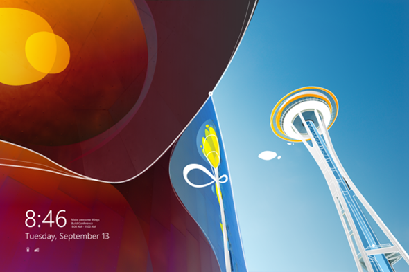
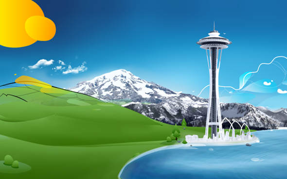
Looking at the earlier concepts, it also becomes apparent just how much depth the stock images have, with various different layers culminating into some very aesthetically-pleasing backdrops. Each has matured from beginning to end, and Microsoft’s Windows 8 package includes some fine examples of architecture and nature. Speaking of the designs, Bauer says:
We got really inspired by the beautiful nature and iconic architecture of the city and the [Redmond] campus. Both elements are integrated in the final design.
It’s unknown whether Bauer will work again for Microsoft in the future, but he seems to have enjoyed his time in Redmond, as demonstrated his "dreamy" state of mind. Still, to be fair, the guy has done a stellar job, and whether you love or loathe Windows 8, you cannot argue that it’s pure eye candy throughout, and the Start Screen and lock screen are key in completing the overall look.
You might also like to view:
You can follow us on Twitter, add us to your circle on Google+ or like our Facebook page to keep yourself updated on all the latest from Microsoft, Google, Apple and the web.

