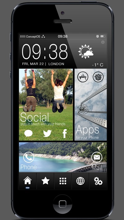
We could be just a couple of months away from gaining an insight into what Apple plans to do with iOS 7, but as the Cupertino company’s software development team continues to work in collaboration with lead hardware designer Jony Ive to create the next revision, many Apple fans have also been offering their own ideas on what could be done to improve the look of the famed mobile OS. We’ve seen quite a few concept designs hitherto, but a theme we recently discovered over on Cydia rather delightfully combines elements of the current iOS interface with a tiled, Windows Phone-esque appearance which in turn borrows from the HTC One’s Sense 5.0 design. It’s an interesting recipe for sure, but as I suspect you’ll agree after seeing the screenshots below, it’s one that works very well indeed.
On the main screen, you have the standard clock / date and weather combination along the top. When either is tapped, the Clock or Weather app is subsequently revealed, allowing you to quickly set an alarm, or check the more detailed weather reports. The rest of home screen interface is dissected by these rather beautiful tiles, with each containing a set of icons specific to the tile’s theme.
The look instantly draws comparisons with Windows Phone 8, but while Microsoft’s smartphone ecosystem operates in a vertical scrolling motion, this theme uses the native horizontal gestures to navigate between pages. Along the bottom are five icons which tell you which page you are on, while also allowing you to jump between screens without scrolling one-by-one.
Despite looking nice, there are obviously a couple of limitations to this kind of design. First of all, the squared-off look doesn’t quite match the smooth, glossy titles borrowed from the current look of iOS, and with no vertical scrolling, the kind of poetic fluency offered by Windows Phone leaves this experience feeling comparatively deflated.
Irrespective of those issues, this theme is one of the best I can recall seeing, and although my not-so-secret liking for Windows Phone’s UI may have something to do with it, the design is still very nice to look at.
It works only for jailbroken iPhone 5 / iPod touch 5G devices, and requires WinterBoard, Gridlock 2.0, Iconoclasm, PageJumps, PerPageHTML and Five Icon Dock in order to work. If you already have those tweaks, or don’t mind downloading the ones you’re missing, simply search for ConceptOS on Cydia under ZodTTD & MacCiti repo and get downloading. Installation instructions are included in the README file found in the theme’s folder. Make sure you read that to setup and configure the theme and widgets.
Be sure to check out our iPhone Apps Gallery and iPad Apps Gallery to explore more apps for your iPhone and iPad.
You can follow us on Twitter, add us to your circle on Google+ or like our Facebook page to keep yourself updated on all the latest from Microsoft, Google, Apple and the web.

