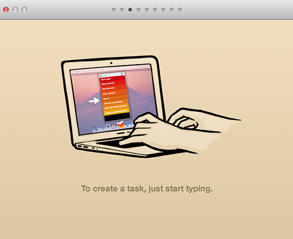
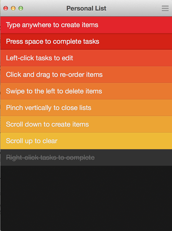
When Clear for iOS was released earlier this year, it not only managed to bring about a wave of clones, but it totally changed the way that developers and users thought about user-interfaces and interacting with on-screen elements. The extremely clean and clinical interface required the user to navigate through it using swipes, pinches and various other gestures that revealed differing menu structures. The developers behind that extremely popular app have fulfilled their promise of platform expansion by releasing Clear for Mac OS X.
The branding, user-interface and color theme setup is immediately recognizable, and anyone who has used the original iOS Clear app will feel at home using the OS X offering. One of the immediate concerns for any user would be how an app that draws its power from the capabilities of the multi-touch display would transfer across to the OS X platform that relies on input through peripherals such as the Magic Mouse and Trackpads. Those who own the aforementioned devices, the input becomes second nature and is practically flawless. For those that don’t, then it may be worth staying away from Clear for Mac.

The look and feel of the app has been pulled directly from it’s iOS counterpart and very much falls into the category of if it isn’t broken then don’t fix it. With that said, rather than just a lazy port across to a different platform, the Realmac team has spent the time to ensure that it matches the aesthetics of the original mobile release, and it feels every-inch an OS X app and gives the impression that it could stand alone as a functional and painstakingly created piece of software.

As you might expect, gestures and pinches play a pivotal role in this version of Clear. Scrolling up creates a new task, while scrolling and holding and clicking then dragging being the key to unlocking some of the more powerful aspects of Clear, such as re-arranging existing tasks into a new order. A lot of thought has been put into how the app actually works, with an intelligent code base that actually understands the hierarchy of the current list and places new tasks in order of creation date.

The ability to change themes also makes an appearance in the Mac version. The default Heat Map theme is by far the best in my opinion, but there is something to suit all aesthetic tastes, as well as the addition of a preferences panel that allows users to set things like the Menu Bar icon and whether or not the app icon should be badged. With iCloud syncing, the OS X and iOS versions of the app work seamlessly together.

Clear may not be the kind of to-do list management app that excites every iOS or OS X user, but it still stands out as the most refreshing and uniquely thought out offering that we have found.
(Source: Clear for OS X on the Mac App Store)
You can follow us on Twitter, add us to your circle on Google+ or like our Facebook page to keep yourself updated on all the latest from Microsoft, Google, Apple and the web.

