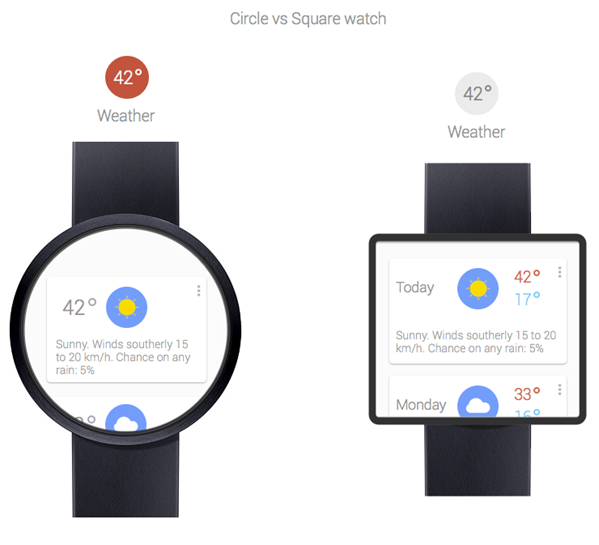
The technology industry seems to be overflowing at the moment with discussions related to whether or not smart watches are a particularly good idea and feasible piece of consumer tech that will stand the test of time. The Pebble E-Paper watch managed to raise a staggering $10 million through its Kickstarter funding, a total that all but confirms consumers are ready for an intelligent watch that can adapt and change depending on the owner and the devices that they own. Although we have subsequently seen a number of smart watches appearing in recent months, we now have a Google inspired concept design coming from design Adrian Maciburko.
Maciburko has named his creation the ‘Google Time’ watch and it is immediately evident that it has been heavily inspired by Google’s clean, light and clinical applications that found themselves on the iOS App Store during 2012. The Pebble E-Paper watch has been so supremely successful due to the high level of customization that it provides through the downloading of purpose built apps as well as coming with the ability to change what is displayed at any given time on the display. The Google Time concept creation takes a few steps back toward minimalism and simplicity and includes a limited number of features.
First and foremost the Google Time smart watch would obviously provide the current date and time by default. After all, It wouldn’t be much of a watch if it didn’t. Maciburko also envisages the watch coming embedded with voice powered search functionality that we imagine would allow web based searches as well as locally for contacts or appointments that were stored internally on the wrist hardware. The display seems to be multi-touch capable and capacitive to allow users to pinch in and out to reveal additional features and menu options such as the ability to check a Google+ account or view the weather.
If you take the potential for native apps out of the equation for the time being it would actually seem to make perfect sense for Google have a watch of this nature that integrates with Google Now. Synchronization features from a Google account would be seamless and with Google taking large steps to improve Google Now, with the introduction of boarding passes and real-time destination based information, the Google Time concept seems to fit that progression perfectly.
It’s a shame that it’s highly unlikely we would ever see a design or concept like this come to fruition but with speculation surrounding a potential Apple and Intel iWatch, we just never know what could be around the corner.
(Source: Adrian Maciburko | Via: Gizmodo)
You can follow us on Twitter, add us to your circle on Google+ or like our Facebook page to keep yourself updated on all the latest from Microsoft, Google, Apple and the web.

