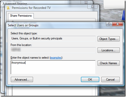
As any software developer specializing in UI elements will vouch, the journey from early concept stage to final design can be as time-consuming as it is frustrating. As with any creation, the initial idea sees many changes as caveats and design constraints mean an idea or concept doesn’t work, doesn’t look write, or isn’t workable. In getting to the final Metro design of Windows 8, Microsoft – the world’s foremost software outfit – had to go through this stage of trial, error and deliberation to get to the final look, and Jensen Harris, a member of the Windows design team, has given a glimpse of some of the company’s earlier Windows 8 concepts in a presentation for UX Week.
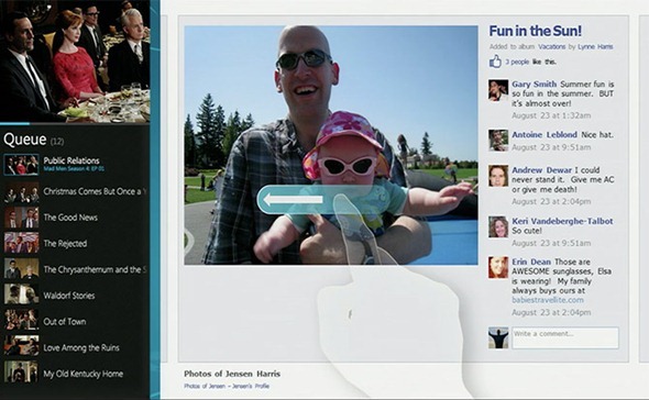
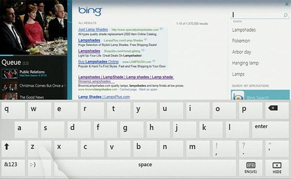
The general consumer response with regards to the new-look interface of Windows 8 has been mostly positive, but Microsoft didn’t just dream up the tile idea in an hour and stick with it. The mockups offer an intriguing insight into how the UI came to be, and judging by these shots, we’re sure glad the Redmond company evolved from the old look:
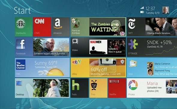
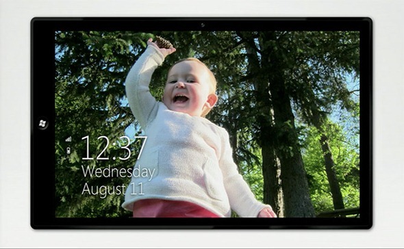
As you can see, the earlier designs of Windows 8 looks extremely untidy when compared with the polished finish we have now. The Start screen looks messy and cluttered, while the time and date is situated in the top, right-hand corner.
Unlike some other Windows revisions, Microsoft really had to rework the Windows 8 interface from the ground up, and although its shares many core trades with the preceding Windows 7, Harris used the presentation to describe the "reimagining" of Windows.
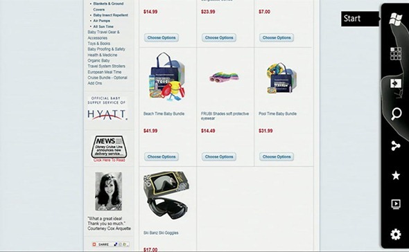
With a “mobile version” of Windows 8 also having been released in the form of Windows Phone 8, Harris couldn’t resist having a little dig at one of its main competitors in the mobile field – iOS. The skeuomorphic elements in Apple’s iDevice software have come under the spotlight recently, no less because the guy who advocated them the most – former SVP of iOS software, Scott Forstall – has now been relieved of his post, and Harris has put the boot in once more by describing them as "cheesy visual effects."
As Apple and Jony Ive look to amend those aesthetic issues, Harris adds that Microsoft is currently checking every detail to make sure no UI elements are out of place – once even forcing the dev team to amend a minor blue flash at the login screen, just to keep everything looking sharp.
It certainly shows, and although WP8 and Win 8 RT have a bit of headway to make, Microsoft seems more than determined to do it; and do it right.
(via iStartedSomething)
You can follow us on Twitter, add us to your circle on Google+ or like our Facebook page to keep yourself updated on all the latest from Microsoft, Google, Apple and the web.

