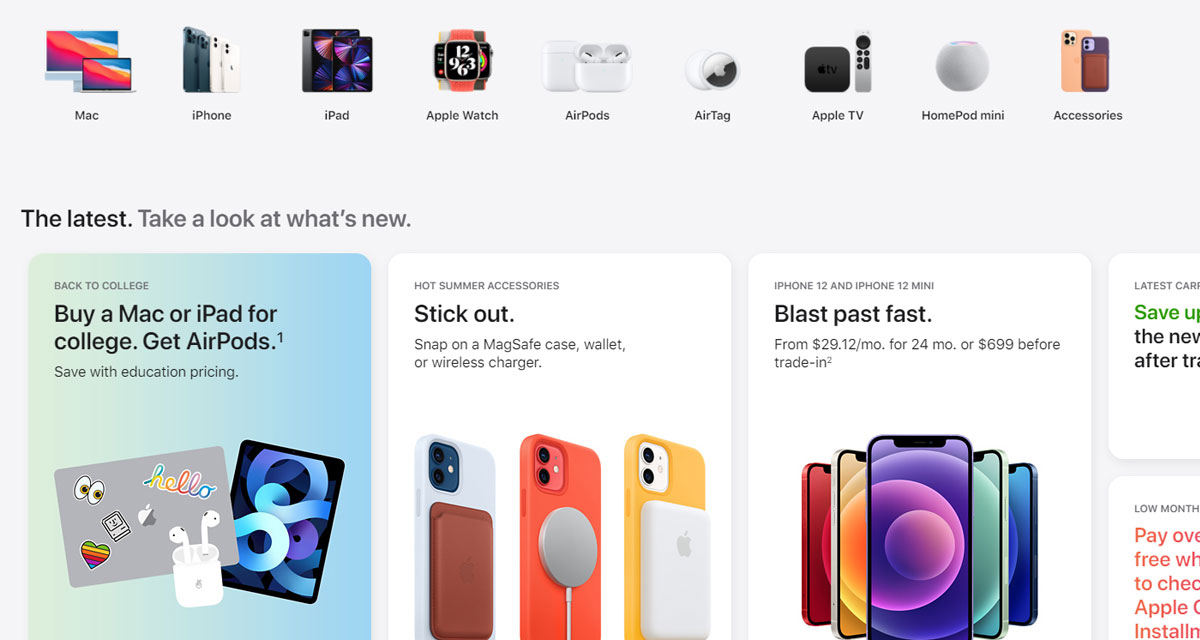
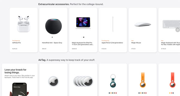
Apple’s website had undergone a rare and overdue redesign, bringing a new look and the return of the Store tab that has been missing for a number of years.
Apple took its worldwide stores down for unannounced maintenance, and while some had pondered whether there was a new product en route, that wasn’t the case.

When the store came back online a new look was immediately evident, with the Store tab now back on the Apple homepage.
Clicking the new Store tab gives customers a carousel of Apple products and categories that can be clicked to drill deeper into the store. Mac, iPhone, iPad, Apple Watch, and AirPods are just some of the categories currently listed.
The new design looks similar to the redesigned Apple Store app and is definitely an upgrade over the often difficult-to-navigate store we had before.

The return of the Store button is perhaps the biggest improvement, giving people an easy and obvious route into the portion of the site where they can place orders. Previously, people had to work their way through the apple.com product pages before they were able to order.
The new process is much more streamlined and is much more similar to the older website from 2015 — and that’s a very good thing indeed.
You may also like to check out:
- Download: Windows 11 Build 22000.100 ISO Beta Update Released
- How To Install Windows 11 On A Mac Using Boot Camp Today
- iOS 15 Beta Compatibility For iPhone, iPad, iPod touch Devices
- 150+ iOS 15 Hidden Features For iPhone And iPad [List]
- Download iOS 15 Beta 4 IPSW Links And Install On iPhone And iPad
- iOS 15 Beta 4 Profile File Download Without Developer Account, Here’s How
- How To Downgrade iOS 15 Beta To iOS 14.6 / 14.7 [Tutorial]
- How To Install macOS 12 Monterey Hackintosh On PC [Guide]
- iOS 15 Beta 5 Download Expected Release Date
- Download: iOS 14.7.1 IPSW Links, OTA Profile File Along With iPadOS 14.7.1 Out Now
- Jailbreak iOS 14.7.1 Using Checkra1n, Here’s How-To [Guide]
- How To Downgrade iOS 14.7.1 And iPadOS 14.7.1 [Guide]
- Convert Factory Wired Apple CarPlay To Wireless Apple CarPlay In Your Car Easily, Here’s How
- Apple Watch ECG App Hack: Enable Outside US In Unsupported Country On Series 5 & 4 Without Jailbreak
You can follow us on Twitter, or Instagram, and even like our Facebook page to keep yourself updated on all the latest from Microsoft, Google, Apple, and the Web.

