Apple has today released a revamped version of its iCloud.com website after a number of weeks of availability in beta form.
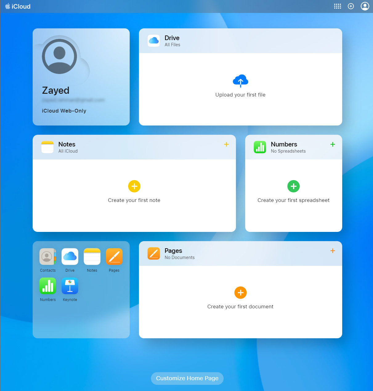
The new update looks more like using a Mac, including a colorful wallpaper as a background.

Those who visit iCloud.com will now be shown a much more modern interface including easy access to apps like Mail, Photos, iCloud Drive, Calendar, and more. The page itself can also be customized to move the apps around and make sure that the most important ones are available depending on user requirements.
The new look is a huge improvement over the previous version and even includes access to things like iCloud Private Relay and HomeKit Secure Video, not to mention Hide My Email.
While many people might not use the iCloud.com website much, if at all, the new version is a big deal for people who have to visit it regularly. Those people might use a Windows PC during part of their day, with this website giving them easy access to their Apple-based services, files, and apps.

You can take the new iCloud.com interface for a spin yourself by visiting the website and logging in using your Apple ID username and password. Give it a try now, you’re going to love it.
You may also like to check out:
- Download: iOS 16.1.1 OTA Profile File, IPSW Links Released
- How To Fix Bad iOS 16 Battery Life Drain [Guide]
- Jailbreak iOS 16.1 On iPhone And iPad Status Update
- iOS 16 Compatible And Supported iPhone, iPad, iPod touch Devices
- iOS 16 Hidden Features: 100+ Changes Apple Didn’t Tell Us About
- Download: iPadOS 16.1 Final OTA Profile File, IPSW Links Released
- Download iOS 16 Final IPSW Links And Install On iPhone 13, Pro, 12, Pro, 11, Pro, XS Max, X, XR, 8, Plus [Tutorial]
You can follow us on Twitter, or Instagram, and even like our Facebook page to keep yourself updated on all the latest from Microsoft, Google, Apple, and the Web.

