Apple’s iCloud website might not be somewhere that many people spend a lot of their time, but that might in part be because it was so bad. Apple is working to change that and it has a brand new version of the entire website available to be tested.
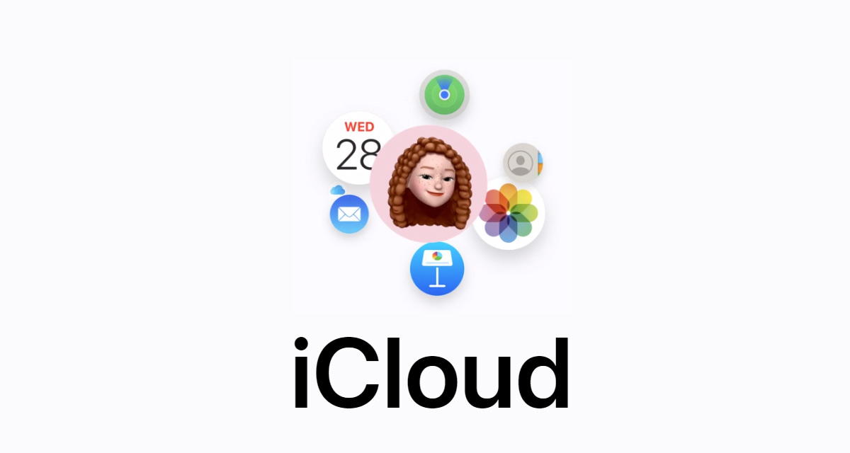
The new beta.icloud.com website displays an all-new look that is very much modernized compared to what we are used to.

Previews for popular apps like Photos, iCloud Drive, Notes, and Mail are all available and there are more options for people who want to customize the way their iCloud home page looks, too. There are also other apps like Pages, Numbers, Calendar, and Keynote available from the same page.
While the most striking difference is on the home page, MacRumors notes that there have also been some tweaks of the actual apps themselves, including toolbars and buttons.
Apple is likely to continue to test the new look over the coming weeks and perhaps months, before rolling the interface out to everyone who visits icloud.com.
The iCloud website is a good way for people to access the iCloud services when they are not at their home machine, or perhaps using a Windows computer at work and it’s good to see Apple working on improving it. Even if usage is likely to be relatively small.
You may also like to check out:
- Download: iOS 16.1 Final OTA Profile File, IPSW Links Released
- How To Fix Bad iOS 16 Battery Life Drain [Guide]
- Jailbreak iOS 16.1 On iPhone And iPad Status Update
- iOS 16 Compatible And Supported iPhone, iPad, iPod touch Devices
- iOS 16 Hidden Features: 100+ Changes Apple Didn’t Tell Us About
- Download: iPadOS 16.1 Final OTA Profile File, IPSW Links Released
- Download iOS 16 Final IPSW Links And Install On iPhone 13, Pro, 12, Pro, 11, Pro, XS Max, X, XR, 8, Plus [Tutorial]
You can follow us on Twitter, or Instagram, and even like our Facebook page to keep yourself updated on all the latest from Microsoft, Google, Apple, and the Web.
