Although the Samsung vs. Apple trial has a decent amount of show time left before the jury is sent to deliberate on what they have heard during its entirety, it seems that Apple has a lot to be positive about. Although judge Lucy Koh has been less than happy so far with the behavior of both legal counsels, it has been the Samsung representatives that have taken most of the judicial negativity thus far, but we should know by now that anything can – and usually does – happen in cases such as these.
Building upon their already strong case against Samsung, Apple has somehow managed to get an internal Samsung document – which has more than 130 pages – submitted as evidence in their favor. The Samsung creation was produced in 2010 as a way for the company to pit their Galaxy S smartphone against the iPhone and break them both down feature by feature to see how they compare. In itself, this shouldn’t come as a huge surprise as I am pretty sure that any large organization will do some kind of comparison against industry leading devices when releasing something in the same marketplace, but it is the contents of the report that could prove damning to Samsung.
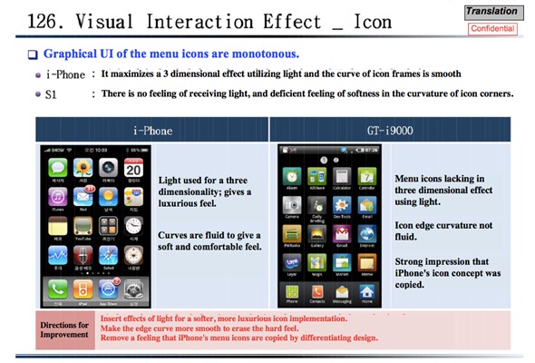
The document has been put together and compiled by the Korean company’s engineering teams which are responsible for the design and development of their smartphone products and pretty much covers all aspects of the two devices broken down into features with a small amount of text relating to how each device performs, followed by images and some bulleted points about each feature. In some instances, the document also contains a Direction for Improvement section which outlines the engineering teams thoughts on the steps necessary to improve upon the existing look and feel of the GT-i9000 (Galaxy S).
The document itself isn’t necessarily a sure sign of guilt that Samsung purposely copied the design of the iPhone, but it doesn’t exactly help which their case, when one of their own internal documents basically says they can improve their products by making them look and function more like the iPhone. In one section of the document, when comparing the visual interaction effect (app icons), the recommendations made actually state that Samsung should “remove a feeling that iPhone menu icons are copied by differentiating design“. Dear me.
This trial still has a fair old distance left to run, but if Apple keeps on submitting evidence such as this document, then it is hard to see the final decision going in favor of anyone other than the Cupertino technology giants.
(via AllThingsdD)
You can follow us on Twitter, add us to your circle on Google+ or like our Facebook page to keep yourself updated on all the latest from Microsoft, Google, Apple and the web.

