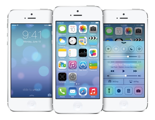
iOS 7 beta has spent the past five days firmly in the public eye, and although opinion is divided as to whether the changes are for better or in fact for worse, the consensus seems to be that the icons are a tad on the bright side. However, it now looks as though the Cupertino company has been tweaking things behind the scenes, with the official iOS 7 beta page on Apple.com showing altered, altogether more subtly toned icons. Details after the break.
Most were expecting iOS 7 to bring a plethora of changes to the fold, and so Monday’s announcement proved. The tech world was clearly not, however, braced for how generally bright the new OS would be, and as such, there has been quite a fuss kicked up following the opening day of WWDC.
But the iOS 7 beta page on the fruit company’s website now, quite literally, paints a different picture, with several of the most retina-risking icons seeming to have been changed to present a more downplayed vibe. The Weather and Photos apps, as well as a couple of others, are a little less eye-catching than before, but considering the complaints we’ve been hearing all week, this is probably a good thing.
The changes only become apparent when browsing the iOS 7 beta page using a mobile device, but on first impression, I would say the new icons do look a little more in-keeping with Apple’s general design philosophies, as demonstrated throughout most of its software products. It’s encouraging to see, and although only four app icons have been changed at this point, I wouldn’t be shocked if Jony Ive decided to give the entire OS similar treatment.
Amid this apparent outcry, what are your initial thoughts on iOS 7 beta? Overall, I feel it is a general improvement on what we’ve seen in the past few iterations, but the degree to which it has been altered is perhaps too much, too quickly. With that said, people – especially techies – don’t respond well to change, but I believe once the end user release of iOS 7 beta makes it out into the wild, consumers will take kindly the vast majority of the alterations that have been made.
Feel free to channel your thoughts on iOS 7 beta by dropping us a comment below – it’s always good to hear from you!
(via: 9to5Mac)
You may also like to check out:
You can follow us on Twitter, add us to your circle on Google+ or like our Facebook page to keep yourself updated on all the latest from Microsoft, Google, Apple and the web.

