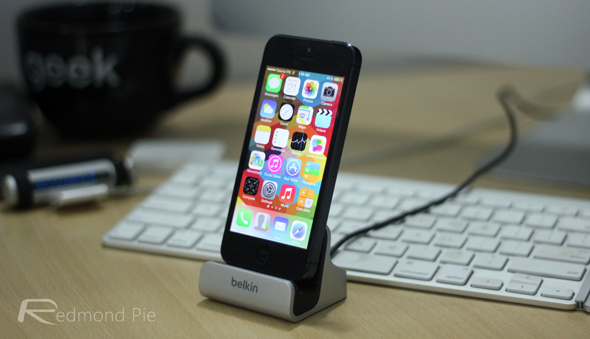
So, it has recently come out of the woodwork that Apple will be holding a special event on September 10th. At this event, it’s widely expected that Apple will release the iPhone 5S, the refresh to the aging iPhone 5, among a few other exciting products. The nature of this event is likely to be focused on iOS devices, it’s almost guaranteed that we’ll see the Golden Master (GM) release of Apple’s new software – iOS 7 – on this date too. And if few more bugs are found, and we’re lucky enough, we might actually see another beta before the GM release.
We’ve now seen 6 beta iterations of Apple’s newest mobile device software, and by this time, it’s far enough into it’s development cycle for me to pass a bit of judgment on. iOS 7 is a software which isn’t aimed at people who are upgrading, it’s aimed at people who are adopting. Apple is trying to ensure their next generation of consumers by creating a more modern, fresh, and fun to use operating system.

It’s clear that most of the changes incorporated into iOS 7 are in there for the long term, and it’s good to see Apple planning ahead with their software design. Things such as Control Center, the quick-toggle access panel which lets you control aspects of your device, make iOS a more pleasurable OS to use.
As for the user-interface changes incorporated within iOS 7, I’m not a huge fan. The design change seems far more drastic than it could have been, again this links back to the changes being put in for new customers, as opposed to old customers. Personally, I would have liked to see the icons themselves change over the course of the beta cycle. It’s clear what the community’s opinion was on the icons, yet Apple continued to blindly stumble down the fluorescent design route. All of the other UI changes, replacing skeuomorphics with Gaussian blurs and gradients, seems to have been done for the good, but there are certain aspects which definitely could still do with work.

Personally, I’m a huge fan of Apple’s new software. I’m a large advocate of change for the better, and I believe that, in Apple’s case, this change was very much for the better. Certain very useful changes such as the Control Center integration and AirDrop functionality certainly outweigh the changes which I’m not as keen on, like the icon design. I’m excited to see the public reaction when it’s released next month.
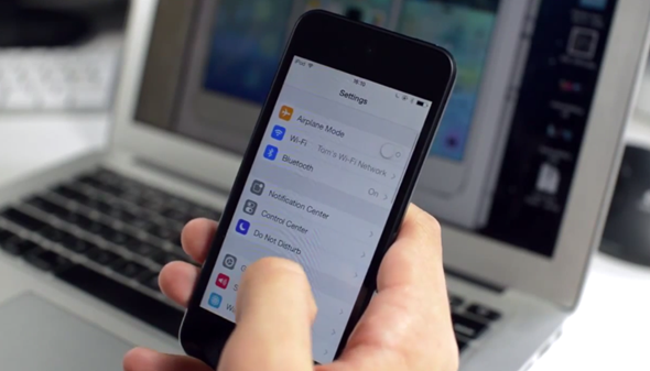
Here are my complete set of thoughts on iOS 7 so far outlined on video:
Subscribe to our YouTube channel for more videos.
You may also like to check out:
You can follow us on Twitter, add us to your circle on Google+ or like our Facebook page to keep yourself updated on all the latest from Microsoft, Google, Apple and the Web.

