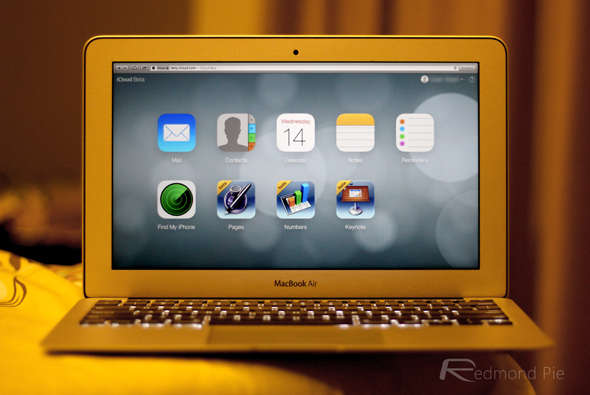
One of the major talking points of iOS 7 ever since its unveiling at this year’s WWDC has pertained to the design. Hardware design lead Jony Ive has been tasked with the job of updating an interface long overdue some change, and although the expulsion of skeuomorphism hasn’t gone down well with everybody, the crowds do seem to be warming to the new look as the betas roll on. Being a company of uniformity, we’d expect the new philosophy to manifest across the board, and as iOS 7 continues its transition from old to new, the Cupertino company has made some similar changes to the beta version of the iCloud.com website.
When it comes to Web ventures, Apple was growing an unwanted list of marked failures, but thanks to its prominence in mobile space, iCloud has been a runaway success story. It took the big companies a while to hop aboard the cloud bandwagon, but thanks to seamless integration with iOS devices and Macs, iCloud has become a staple part of the entire infrastructure.
iCloud.com is the Web-based go-to for all iCloud users, and as well as allowing subscribers to check contacts, mail and the like, also offers a nifty feature for locating lost iPhones. With 320 million registered users and counting, it’s an integral component in the Apple steelworks, and naturally, with so many folks seeing it, Apple wants the new look to be at the heart of the iCloud.com site’s design.
The new look is available to see at beta.icloud.com, with the regular site still taking the older, shiny-glass-on-icons form. Still, we’d expect the main site to be updated in due course, and although the new look might have been a lot for iOS users to take in upon seeing iOS 7 for the first time, the flat shapes and clean colors actually look rather nice on the Web.
As Apple busies itself with the preparation for a plethora of new gadgets this fall, it may well be that certain portions of its Web and software range don’t get the Ive-era makeover straight away. Still, if there was ever any doubt whether Apple believed in its new design philosophy, head over to beta.icloud.com and check out an iOS 7-ified webpage in all its glory.
You may also like to check out:
- How To Download iOS 7 Beta 5 [Dev Download Files]
- iOS 7 Beta 5 Download For iPhone 5, 4S, iPad And iPod touch Now Available
You can follow us on Twitter, add us to your circle on Google+ or like our Facebook page to keep yourself updated on all the latest from Microsoft, Google, Apple and the Web.

