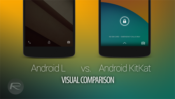
The next major version of Android, dubbed as ‘L’ (Lollipop?) was announced by Google at its I/O developer conference in San Francisco. Android L brought with it a ton of new changes, most of which are for developers. But the user-facing end got a neat facelift too, and as ever, we took the latest OS from the search giant for a spin on a Nexus 5, and couldn’t help comparing it with last year’s offering, Android KitKat.
Visually, there are a lot of small changes in Android L that sets it apart from KitKat in a lot of ways. For starters, the navigation keys have gotten a good makeover, and if you’re asking us, they look a lot like the buttons found on the PlayStation controller. Just putting it out there.
The new ‘Material Design’ language from the search giant is very evident in Android L, and you get a sense of depth in the UI as a whole, instead of just pages of text and images flying around. You get a proper feel of information being stacked on top of one another, and gives the overall impression of a real, desk-like experience, but minus the clutter. These things are very evident in apps like Gmail, the multi-tasking switcher etc.
From the screenshots it’s evident that Google is flattening things out in Android and wants the user to focus more on their content rather than being caught up in the UI itself. In our books, that’s a good thing.
The keyboard has gotten drastic makeover in Android L as well, and looks much more cleaner than ever before. Aesthetically, it’s a big u-turn comparing it to the way it was before. But for those who are accustomed to the older Google Keyboard, the new keyboard in Android L might feel a little cumbersome to get used to, but with time, you eventually will get a hang of it.
Enough of the babbling, let’s dive right into the visual comparison, starting with the lock screen itself, and then going into other things, like UI elements, system apps, etc..
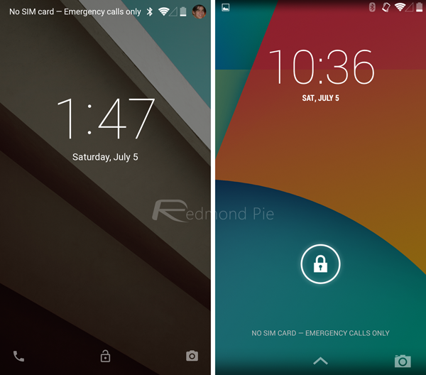
Android L lock screen (left) vs. Android KitKat lock screen (right)
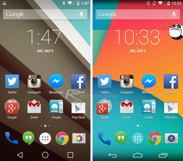
Android L home screen (left) vs. Android KitKat home screen (right)
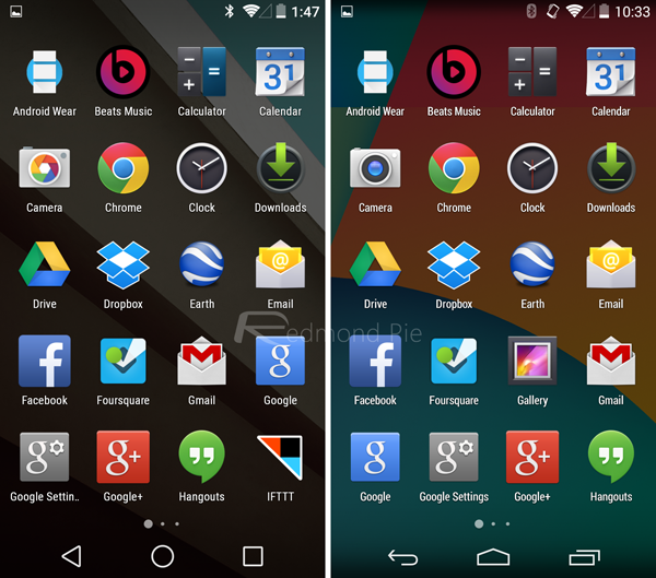
Android L app drawer (left) vs. Android KitKat app drawer (right)
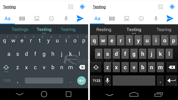
Android L keyboard (left) vs. Android KitKat keyboard (right)
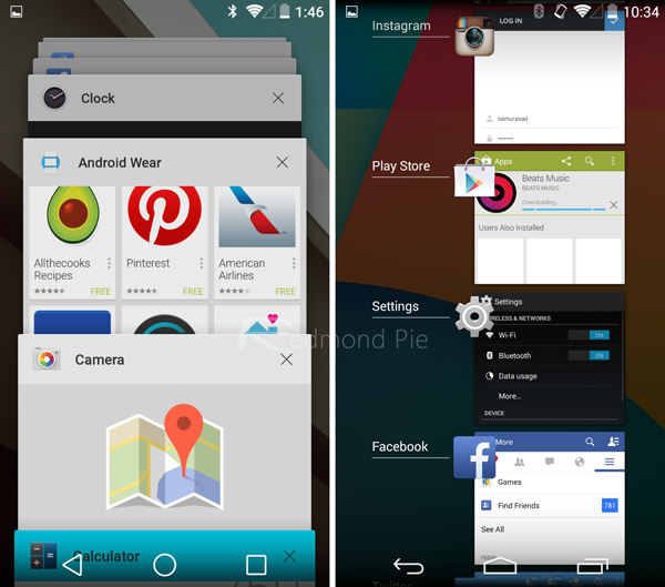
Android L multitasking switcher (left) vs. Android KitKat multitasking switcher (right)
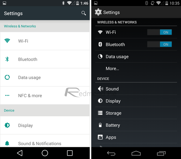
Android L Settings app (left) vs. Android KitKat settings app (right)
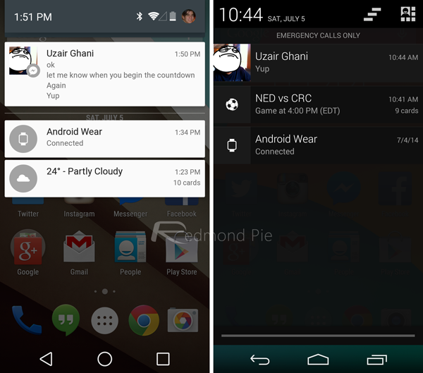
Android L pull-down notifications shade (left) vs. Android KitKat pull-down notifications shade (right)
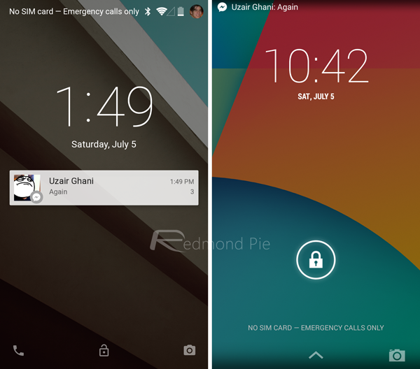
Android L lock screen notifications (left) vs. Android KitKat lock screen notifications (right)
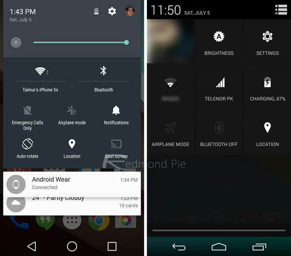
Android L quick settings (left) vs. Android KitKat quick settings (right)
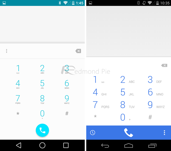
Android L Phone app (left) vs. Android KitKat Phone app (right)
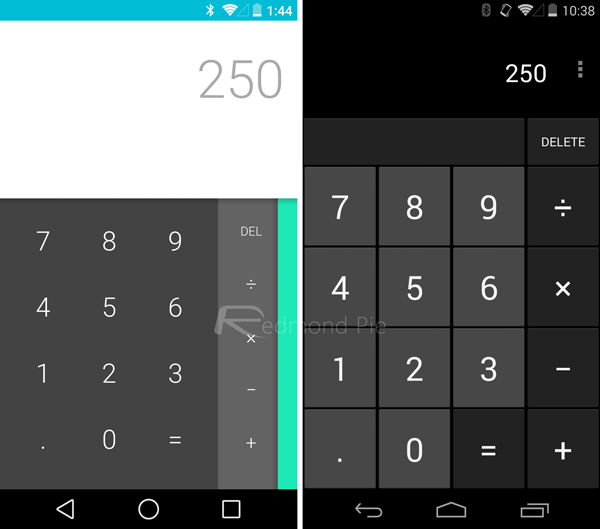
Android L Calculator app (left) vs. Android KitKat Calculator app (right)
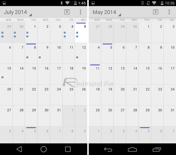
Android L Calendar app (left) vs. Android KitKat Calendar app (right)
In some areas, Android L remains unchanged compared to KitKat, this is partly due to the fact that some Android apps are due for an update from Google’s side. But we’re certain that will be dealt with when Android L is available to everyone come this fall. After all, it’s a developer preview and things are bound to change.
So what do you think about Android L? Do you think it’s a modest upgrade over Android KitKat? We certainly believe so that it is.
You may also like to check out:
You can follow us on Twitter, add us to your circle on Google+ or like our Facebook page to keep yourself updated on all the latest from Microsoft, Google, Apple and the Web.

