One of the more significant additions to Windows 8 (on the latest Consumer Preview build) – which is critical for the platform to succeed in the tablet space – is the Windows Store, essentially an app store where you can purchase applications for Windows, particularly Metro-style ones. Thus, in terms of functionality, it’s pretty much like a combination of the iOS and Mac App Stores. But, in usability and design, it does have its differences.
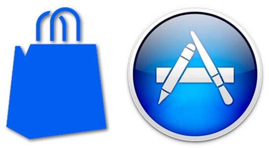
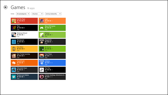
For one, it’s a Metro app. So gradients, more "thick" graphics, and drop-shadows are ditched in favor of a flat – albeit clean – design.
On the other hand, we have the App Store, which has all of these "thicker" design elements.
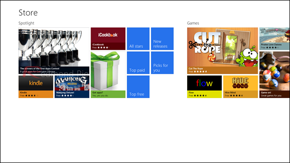
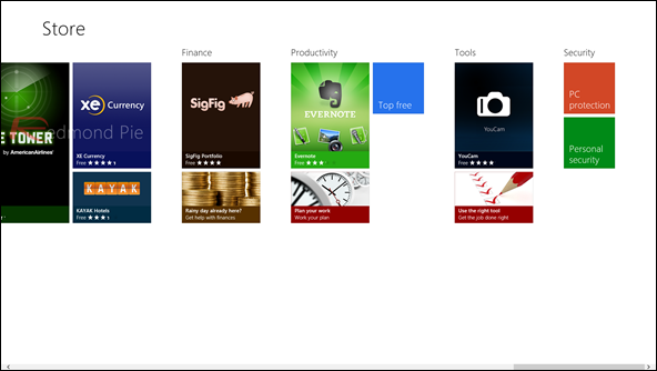
On the main page of the Windows Store, you scroll horizontally to glide through the various top apps in each category. There’s the Spotlight (which pools top apps from all categories), Games, Music & Videos, Books & Reference, News & Weather, Finance, Productivity, Tools, and Security categories to choose from on the page, among others.
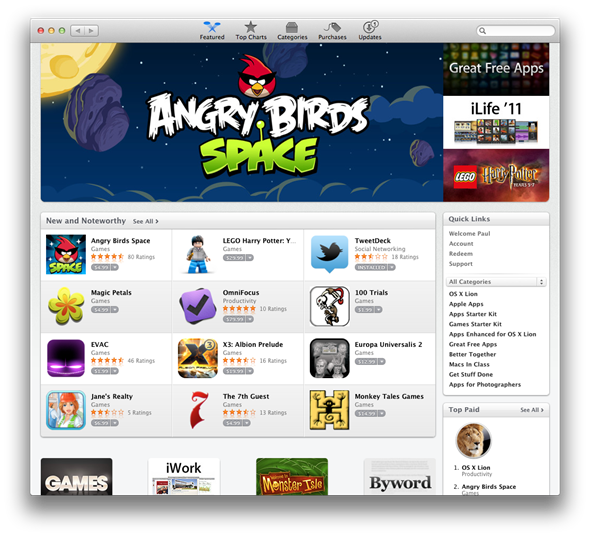
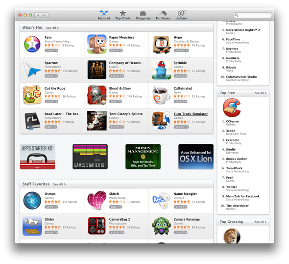
On the main page of the Mac App Store, we see a few categories to showcase top apps. The top paid, free, and grossing apps are shown off in the sidebar (but they do have a dedicated page, if you click on "Top Charts" within the App Store), and, through three Spotlight-esque categories, more exceptional apps are shown off.
To get a closer look within a category in the Windows Store, you may click on the category title on the home page or perform a search for it. Then, all of the apps within that category will be retrieved before your eyes.
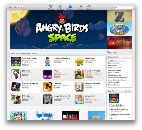
To do this in the Mac App Store, you can either click on "See All" if the category you desire is on the main page, or you can click on Categories and select your category of choice from there.
You can also view either the "Top Free" or "Top Paid" games in each category in the Windows Store. Same with the Mac App Store.
If you opened the Windows Store knowing exactly what you’re looking for, and don’t need to poke around the categories, then simply pull up the Charms bar and search for an app. Now, here’s one thing that some newcomers to Windows 8 may find confusing; if they don’t know about the Charms bar, and about how it essentially acts as the search functionality in Metro apps, they wouldn’t know how to search for apps in the Windows Store since it has no built-in search box.
A more detailed description of the app is displayed by clicking on it in both stores.
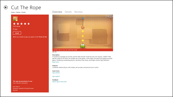
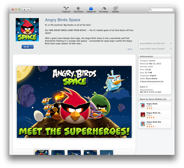
And from here, you can also install the app in both app stores. Simply click install, and it will be waiting for you back on the Start Screen in Windows. Now, I do kind of wish that iOS and Mac functionality was mimicked here; when you download and install an app, you aren’t automatically brought out of the store and brought to the Start Screen, as you are when you purchase an app on an Apple device. In most cases, when you purchase an app, you want to jump right into it.
In conclusion, the Windows Store is a pretty robust and easy to use marketplace for apps. It has its similarities and differences to Apple’s own marketplace offerings, but it’s mostly pleasant to use. For the most part, it is simple in both usability and aesthetics.
As of right now, I do prefer the design of the Mac App Store. It’s very nicely designed, and it’s simple and effective. Usability-wise though, they’re pretty close to me. I have no significant quarrels with either.
For discussion on this topic: Check out the threads on Facebook or Google+.
You can follow us on Twitter, add us to your circle on Google+ or like our Facebook page to keep yourself updated on all the latest from Microsoft, Google, Apple and the web.

