Microsoft has a dedicated Mac team at their HQ solely to develop for Macintosh platform. While they have done great stuff with Office 2008 for Mac; Messenger for Mac has been a real disappointment for me.
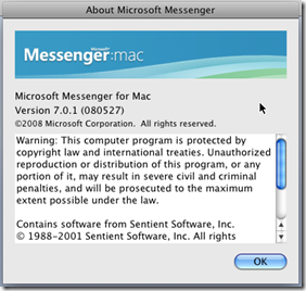
In June 2008, Mac BU (aka Mactopia) team released the latest version(7.0.1) of Messenger for Mac which improved support for users of the VoiceOver feature in OS X. It also fixed user interface issues that appeared when Messenger was used with some European languages. But even this latest version is a no match to its Windows counterpart, known as Windows Live Messenger.
Here is a look at all the misses of Messenger for Mac:
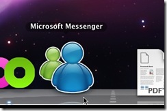
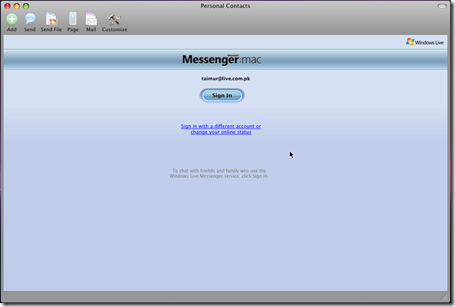
Sign In Window: Looks cool isnt it? Fits well in OS X 10.5 Aqua interface.
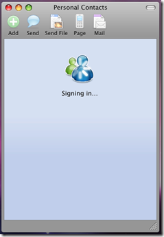
Signing In…
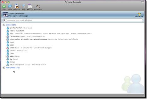
All looks good until you reach this window. The first thing you notice is that there is no way to see your contacts display pictures in the “Online” users list.

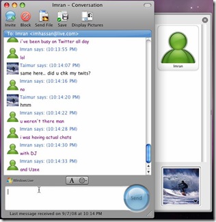
Chat Window: For some strange reason, I couldn’t get the display pictures of my contacts loaded up in a chat window. Maybe the feature isnt there?
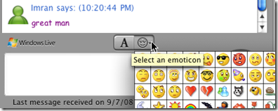
Chat window is missing loads of features: nudges, custom backgrounds, winks, handwritten messages, sharing folders, color scheme, even video calls to Windows Live Messenger friends.. and the list goes on & on..
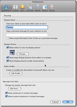
No option to have the same personal message and display picture from wherever I sign in.
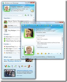
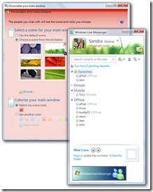
Earlier this past week, LiveSide showed off the new UI and features which will be part of Wave 3 release of Windows Live Messenger.
Windows Live Messenger Wave 3 Images – Courtesy: LiveSide
As you can see from the screenshots of the new Windows Live Messenger above, Messenger for Mac has lots of work needed in order to catch up with its Windows counter part. Will we see a new release of Messenger for Mac once Windows Live rolls out Wave 3 to public? mm Maybe but for that to happen, the Mactopia & Windows Live team has to work together or else I fear that our Windows Live friends on OS X will soon look for alternatives.

