It feels like only yesterday that we were eagerly awaiting the kickoff of this year’s Worldwide Developers Conference (WWDC). For developers, the opening keynote of the event symbolizes the beginning of a full week of informative sessions and workshops, as well as the chance to interact with some of Apple’s finest engineers.
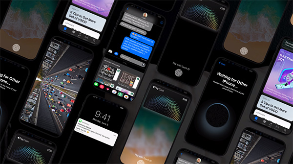
For the rest of us, it’s a chance to see the future of iOS, macOS, and Apple’s other platforms, as well as get an insight into any hardware improvements on the roadmap. We’ve now seen what Apple is planning with iOS 11, but we are also getting a chance to see that platform in action on the iPhone 8 courtesy of designer Vianney le Masne.

There can be no denying that Apple has done a wonderful job pushing iOS forward. The newly demonstrated features within iOS 11 have been as well received as the tons of smaller refinements and improvements that have been discovered since the initial beta was launched.
However, we have yet to actually see Apple showcase iOS 11 directly on an iPhone 8 for obvious reasons. We have been privy to a small leak which showed various parts of iOS 11 embedded within an iPhone 8 display, but that’s as close as we have been, until now.
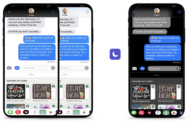
Designer Vianney le Masne has taken into account all of the currently known information in order to put together the best guess on what he feels Apple’s next-generation iPhone will look like. Within that device, he has showcased various aspects of iOS 11, including the standard interface as well as an inverted view to highlight how beautiful and contrasting a Dark Mode could look when activated by the user on the OLED display.

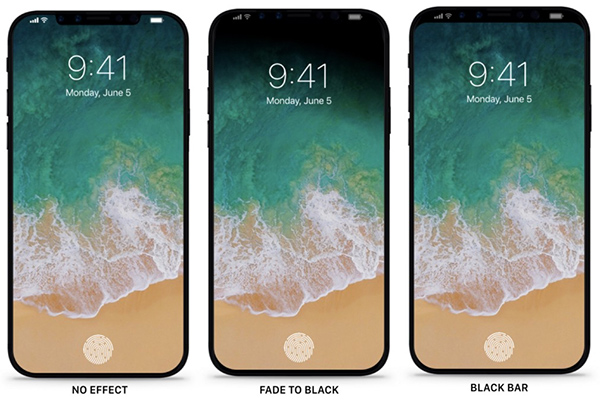
The video also shows a little creative thinking to suggest that Apple could use very subtle and beautiful fades and blends as content falls into the edges of the display.

Even though most mockups tend to show iOS 11 using maximum screen real estate (left), I wouldn’t be surprised if Apple defaulted to subtle ways to blend the screen into the edges using fade-outs or simply making the top bar black. As mentioned previously in my post about the iPhone without borders, every classic layout reminding the users that they are interacting with a rectangle will be an unnecessary way of taking them out of the experience, even for a microsecond.
Check out the embedded video for yourself and see just how beautiful iOS 11 looks on that stunning edge-to-edge display. Is this the kick that you need to start seriously considering Apple’s next-generation iPhone?
(Source: Vianney le Masne [Medium])
You may also like to check out:
- Leaked iPhone 8 Screen Protector Reaffirms Rumored Design With Notch Along Top Bezel
- iOS 11 Beta 2 Download Expected Release Date
- iOS 11 Beta Compatibility For iPhone, iPad, iPod touch Devices
- How To Downgrade iOS 11 Beta To iOS 10.3.2 / 10.3.3 [Tutorial]
- Download iOS 11 Beta 1 & Install On iPhone 7, 7 Plus, 6s, 6, SE, 5s, iPad, iPod [Tutorial]
- Jailbreak iOS 11 On iPhone And iPad [Status Update]
- Jailbreak iOS 10.3.2 / 10.3.1 / 10.3 / 10.2.1 For iPhone And iPad [Latest Status Update]
- Download iOS 11 Beta OTA Configuration Profile Without UDID / Developer Account [How-To Tutorial]
You can follow us on Twitter, add us to your circle on Google+ or like our Facebook page to keep yourself updated on all the latest from Microsoft, Google, Apple and the Web.

