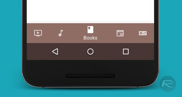
Google has released a new set of design guidelines that could see popular Android apps start to look a little more like they were designed with iOS in mind. Google’s updated Android design guidelines now suggest that developers should, where suited, use the bottom of the screen in order to show buttons that allow the user to navigate through different parts of the app. If that sounds familiar, it’s because that is how many, many iOS apps currently work.
Dubbed the “bottom navigation bar,” the area at the bottom of apps is expected to feature between three and five different destinations within the app itself. Google says that any app with less than three options may use tabs as an alternative, while those with more than five should stick to the hamburger menu that would otherwise have been deprecated by this change to Google’s newly altered design ideas.

While the potential is there for this move to make apps on Android look very similar to those on iOS, Google has added its own spin to things by making it possible for icons within the bottom navigation bar to be resized in order to depict the options at hand. Those same icons will also be able to nudge other icons out of the way in order to get a user’s attention and to show when a particular button has been selected.
Up to this point, the hamburger menu icon on Android has hidden many apps’ different options and views, and while it won’t be going completely away, the move to having navigation buttons live at the bottom of apps will certainly make it easier for those of us that switch between Android and iOS devices regularly.

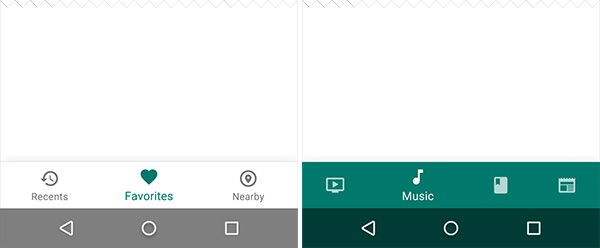
Bottom navigation bar with three destinations showing all icons and labels (left) versus bottom navigation bar with more than three icons (right)
And here’s what it has always been like on iOS:

If you want to see what the new navigation bar looks like on Android devices, the existing Google+ app has already received the update, with Google Photos also rocking the new look.
(Source: Google Design Guidelines)
You may also like to check out:
- Android N Features And Changes: Everything That’s New
- How To Install Android N Preview OTA Update Via Android Beta Program [The Easy Way]
You can follow us on Twitter, add us to your circle on Google+ or like our Facebook page to keep yourself updated on all the latest from Microsoft, Google, Apple and the Web.

