Microsoft’s Xbox One is the console that the company hopes will carry it through to 2020 and beyond, but while all the talk is often about how powerful these new game consoles are and whether they will usher in a new era of hyper-realistic games or not, often one of the important aspects of a new console is overlooked – how does the thing look?
While new games and franchises that make the mouth water are all very exciting and certainly likely to sell hardware in the long run, we spend more time looking at the hardware that powers everything than we do actually playing games. After all, the Xbox One is going to be sat under your television 24/7, even when you’re not playing games on it. You don’t want it to be ugly, do you?
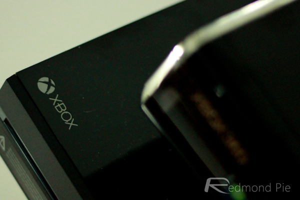
The original Xbox 360 was one of the better looking consoles we had been able to buy in the history of home consoles, and as the hardware changes throughout its lifecycle the final product ended up looking, unsurprisingly, more like the Xbox One than the original beige Xbox 360. Even with that in mind though, the Xbox One is still a departure from what we were used to in quite a few ways.
The main event – the console hardware
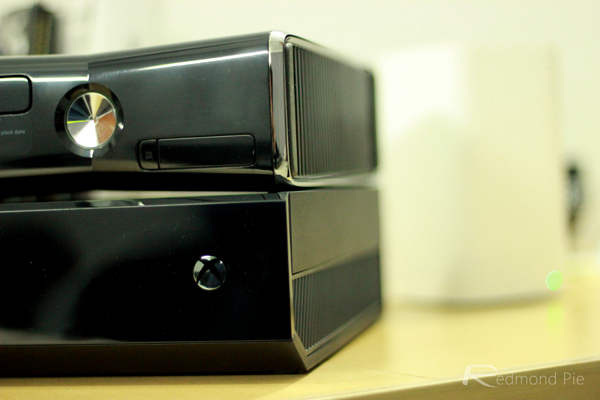
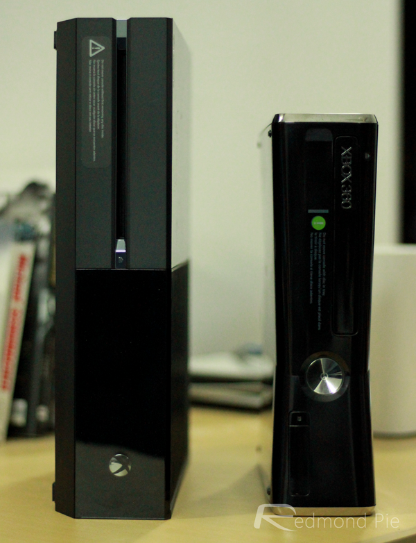
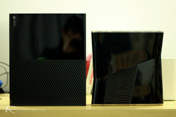
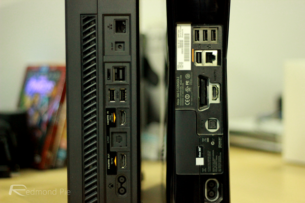
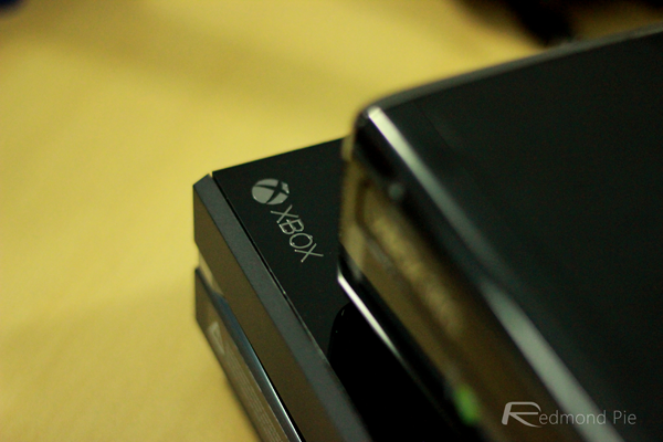
To look at, the Xbox One almost looks like two machines welded together in the middle. We’re quite keen on how it looks, but that comes after a good few weeks of rather despising it initially. Turns out first impressions aren’t always as important as people like to make out.
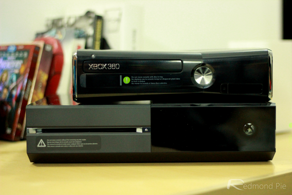
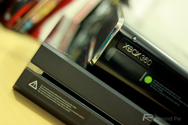
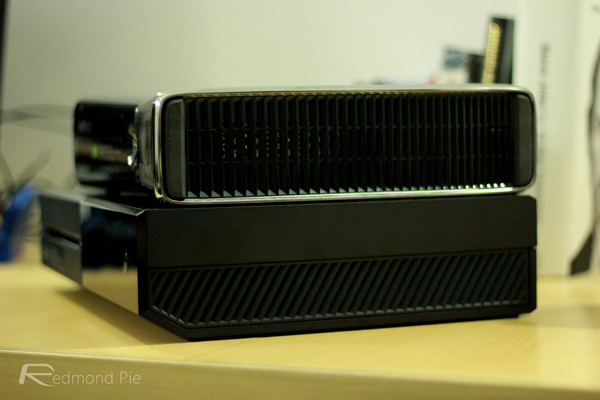
There’s no denying the fact that the Xbox One is a big hunk of technology, but that gives it a sense of power, a sense of authority which is also helped by its being much squarer than the older, more curvy Xbox 360. It’s obviously an approach that people will or will not like, but we’re unashamedly in the camp belonging to the former.
The controller
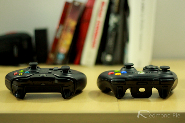
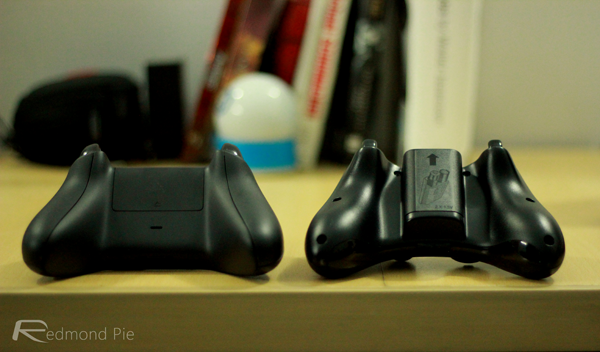
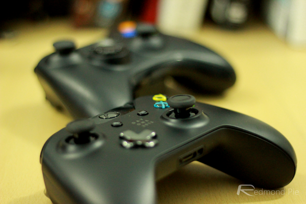
The Xbox One controller is very much an evolution of the original Xbox 360 controller, rather than a revolution. And that’s a good thing, because there wasn’t a great deal wrong with that except some niggles surrounding that D-pad. Still, to look at the similarities are hard to deny and we’re perfectly happy with that.
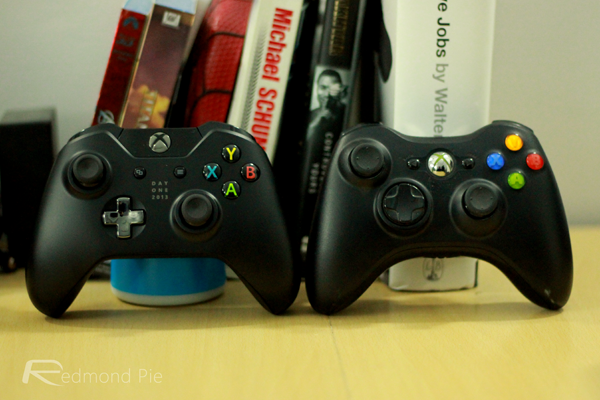
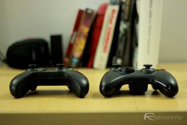
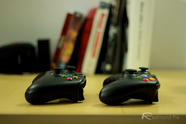
The glowing Xbox button has moved, and the layout of some of the other buttons has altered slightly but as far as the overall aesthetics are concerned, if you liked the look of the Xbox 360’s controllers, then you’re not going to be disappointed with what the Xbox One has to offer. Especially if you managed to snag yourself one with the silver ‘Day One 2013’ text emblazoned on its face.
Kinect
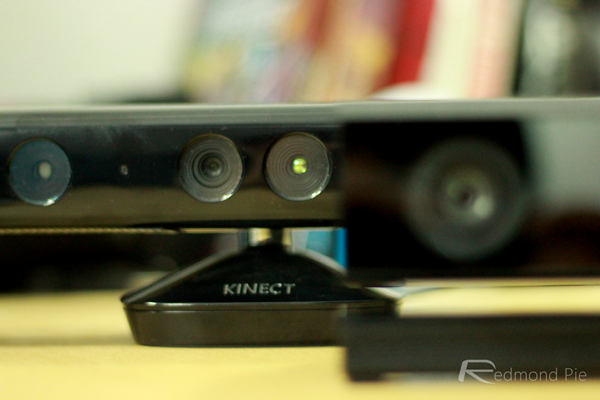
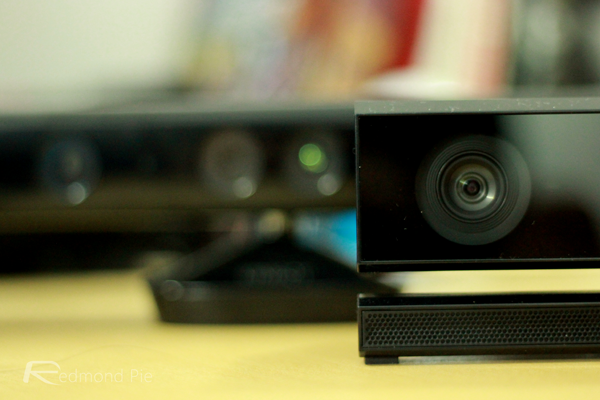
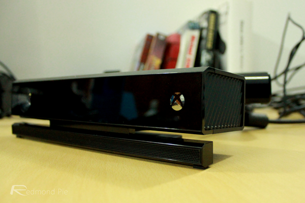
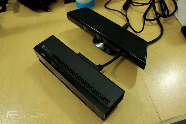
Following on from the design philosophy of the Xbox One itself, the all-new Kinect sensor is again considerably more squarer than its older sibling. The internals are beefed up in order to increase performance, and the motor has gone, which makes the the fact that the overall size is similar slightly disappointing. It’s not huge, but it’s not diminutive either.
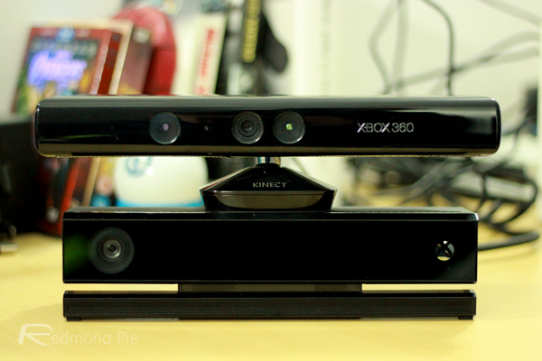
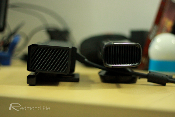
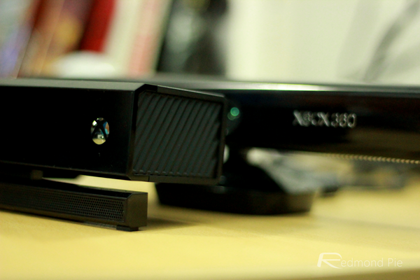
There isn’t a great deal to say about the Kinect really, it’s square, it’s black, and it’s got an Xbox logo on it.
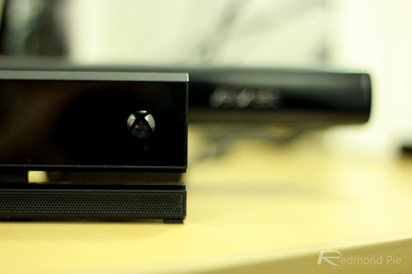
We’d argue that the Xbox One is the nicer machine to look at when compared to the Xbox 360, though we can certainly understand why some people may call it ugly. For us, the PS4 is the nicest-looking next-gen console out there, but the Xbox One is no slouch in the looks department either.
You may also like to check out:
You can follow us on Twitter, add us to your circle on Google+ or like our Facebook page to keep yourself updated on all the latest from Microsoft, Google, Apple and the Web.

