Although many key details pertaining to Apple’s forthcoming iOS 7 remain under wraps, one seemingly certain alteration will be the removal of the skeuomorphic elements that have been a hallmark of the fruit company’s mobile operating system from the get-go. Jony Ive is said to be heavily involved in revamping the look and feel of iOS this time around, and with former iOS Senior Vice President Scott Forstall now out of the picture, the Cupertino’s lead hardware designer now has free reign on the software side of things, too. In addition to the deluge of reports we’ve seen and heard recently regarding the supposed flatness of iOS 7, sources in the know have informed 9to5Mac that iOS 7 will be, and I quote, “black, white, and flat all over.”
In essence, this perhaps doesn’t tell us much we don’t already know, but it does throw even more weight behind the notion that the glossy glass, rough leather and stitching effects will be getting their last run-out with the current iOS 6 software.

Since these latest murmurings tie in rather nicely with pretty much everything else said of iOS 7 throughout the blogosphere, I would be inclined to believe this recent source is right on the money.
Said source has apparently managed to grab a glimpse at some of the changes Apple has been making to the aesthetic of iOS, and although things could undoubtedly be changed between now and June 10th — this year’s Apple Worldwide Developers Conference (WWDC 2013) at which iOS 7 will be showcased — it’s unlikely Apple will want to risk making too many further tweaks given how little time there is to run the necessary tests.
The new-look lock screen is supposedly much less glossy than before, with a clean, black interface doing away with the rather unnecessary life-like finish. When entering the passcode, the omni-present square grid makes way for a rounder, sleeker ensemble of black buttons, complete with white text and borders.
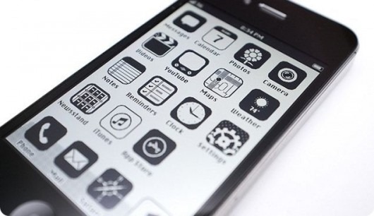
This same kind of color scheme manifests itself throughout the OS, with flat, monochrome features visible throughout. From the Calendar app to the Notification Center, it would seem as though Apple has whipped everything back to basics, and considering how tiresome and grating the current, almost unchanged look has become, I would imagine that iPhone, iPad and iPod touch users will welcome the visual overhaul.

Jailbreak theme: iPhone OS ‘86 – available on Cydia
What do you think, is a black and white, flat look the answer to the rather stagnated state of iOS? Do share your comments via the usual mediums below!
(source: 9to5Mac)
You can follow us on Twitter, add us to your circle on Google+ or like our Facebook page to keep yourself updated on all the latest from Microsoft, Google, Apple and the web.

