It’s becoming a case of another day, another iOS 7 concept as we close in on this year’s Worldwide Developers Conference, and with the Cupertino company said to be drafting in OS X developers to help ensure the company’s forthcoming mobile OS version is ready on time, the tech world is busy dreaming up new ideas of what could and should be included in the update, commonly known as iOS 7, which is highly expected to debut at WWDC 2013. Today, yet another concept has been brought to our attentions, and offers an intuitive design taking into consideration the new flat surfaces said to be replacing the omni-present skeuomorphism throughout iOS. We’ve got full details, as well as a demonstration video of this rather tasty concept, coming up right after the leap.
In a follow up to his two previous concepts in the series, Belgian concept maker Mohamed Kerroudj has now factored in one or two recent reports pertaining iOS 7, there is, theoretically at least, a chance that his designs offer a glimpse into the kinds of ideas Jony Ive could be pondering with the real thing.
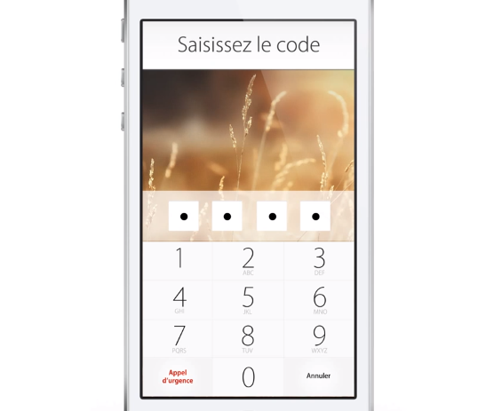
The new concept video, which you can watch at the bottom of this post, kicks off with a beautifully clean, plain white Passcode lock screen, and when the digits are punched in, a completely revamped iOS experience then begins to unfold.


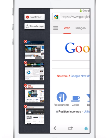
Safari is the native browser of iOS, and while it caters to most as a respectable, decent browser, it’s certainly no great shakes. Kerroudj turns the Web-surfing app completely on its head with his iOS 7 concept, and appears to borrow from the popular Dolphin browser in allowing left / right pull-in gestures to reveal a plethora of additional options including tabs and favorites on either side.

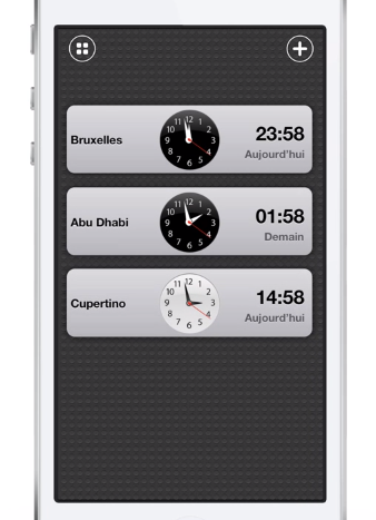
Certainly the main appeal of this concept is in the fact that it brings the OS X Dashboard into play, and although this is perhaps a questionable move given that a large portion of Mac users don’t care for the widget portal, I would say Kerroudj’s presentation makes it appealing once again.

Check out the video of the concept below:
What do you think – would an adaptation of the Dashboard be solution for iOS’s lack of widgets? Or would Apple be flogging a dead horse by attempting to rejuvenate iOS with a failed OS X app? Please do leave your thoughts below.
Thanks, Marco for the hat tip!
You can follow us on Twitter, add us to your circle on Google+ or like our Facebook page to keep yourself updated on all the latest from Microsoft, Google, Apple and the web.

