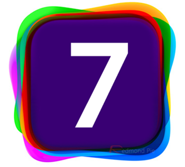
If everything goes according to the speculated plan then it should only be a matter of weeks until Tim Cook fills us all in on the future of iOS. Until we hear otherwise, we are expecting WWDC 2013 to be heavily iOS centric with Sir Jonathan Ives likely to unveil the direction he and his team have taken with Apple’s mobile operating system after taking over from Scott Forstall. As you would expect, we have seen many designers stepping forward with their own iOS 7 concepts, depicting the future of Apple’s famed mobile operating system, but the latest one is perhaps one of the most beautiful and certainly one that we wouldn’t be upset with if it made its way onto the next generation of iOS devices.
It’s all well and good for us to talk about possible features, implementations and the likelihood of Apple adopting a more flat philosophy when it comes to iOS 7, but it always helps to be able to see things on the screen in front of us. Simply Zesty has given creative freedom to their Art Director Phillip Joyce, who has not only produced a rather glorious walkthrough of his ideas but has also pretty much overhauled the whole user-interface to make it look and feel extremely modern and elegant.
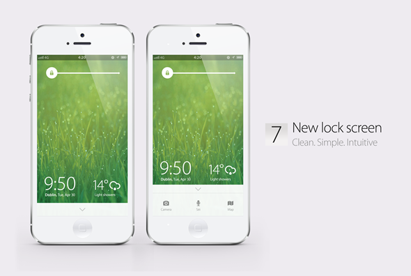
The lock screen section of the new iOS 7 concept has been completely overhauled from the ground up. The slide-to-unlock implementation is still present, but has been made to occupy a lot less screen real estate and is now located at the top of the display to make room for Camera, Siri and Maps at the bottom of the display. The whole thing is cleaner, simpler and uses clinical colors with clean cut lines to emphasize on the elegance.
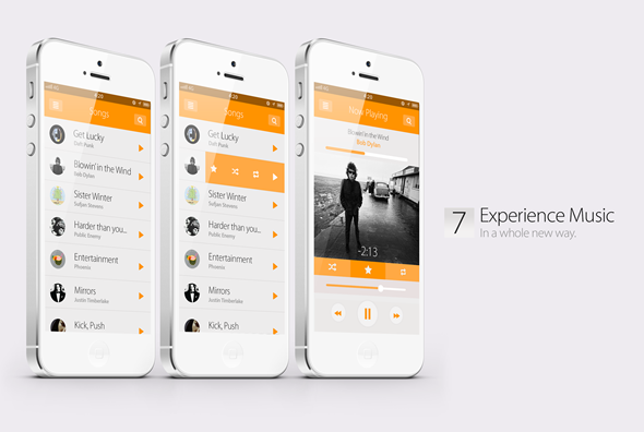
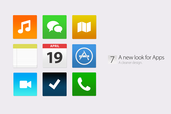
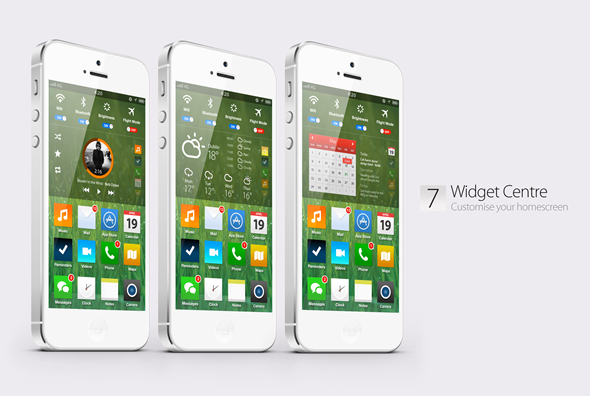
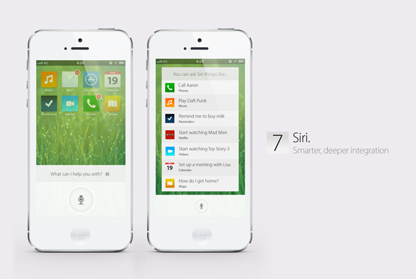
The concept also gives Apple’s native apps, such as Weather, Mail, Messages and Calendar, a cleaner and flatter look with very minimal rounded corners. The colors are vibrant and familiar and look perfectly placed in the new Widget Center that would allow users greater control over how they customize their home screens. It’s fair to say that this concept has taken a fair amount of inspiration from Microsoft’s Metro / Modern UI, but that is definitely not a negative comment. It also goes well with the recent rumors, almost confirming flat UI for iOS 7. Have a look at the concept video:
Thoughts?
(Source: SimplyZesty)
You may also like to check out:
You can follow us on Twitter, add us to your circle on Google+ or like our Facebook page to keep yourself updated on all the latest from Microsoft, Google, Apple and the web.

